In this article I’m going to share eight forms of visualizations that can help you come up with a standing research presentation after conducting qualitative analysis in MAXQDA.
This include one document portrait.
Two code line

Three document comparison chart

Four code matrix browser

Five word cloud

Six code cloud

Seven Word trends
Eight max maps
I’m also going to show you two bonus documents that can enhance your qualitative results report.
Qtt worksheet and the code document export.

My name is Bernard Mugo. I like to refer to myself simply as an academic.

In the past three years, I’ve helped more than 200 PhD students analyze qualitative data and dissertations.
In the course of helping such a large number of students, I’ve gained invaluable experience in the best practices that you can use to perform qualitative analysis of your interviews and be able to retrieve quality findings.

in this article the data I’m going to be visualizing comes from a previous article that I did where I went from raw transcripts all the way to coming up with codes, themes and writing the findings report.
Now let’s go and open MAXQDA.
This is the MAXQDA file that I’ll be working with or that we are going to use for the visualization.
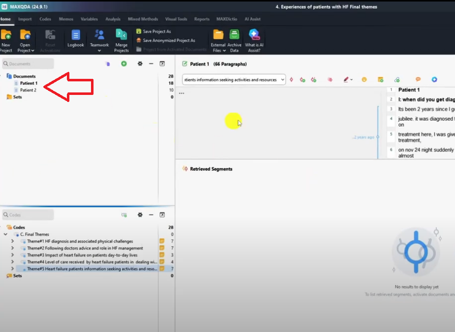
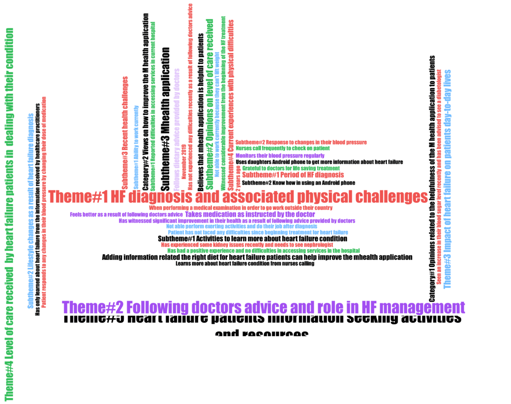
I already did the themes in my previous article so let’s go and visualize.
Color coding themes
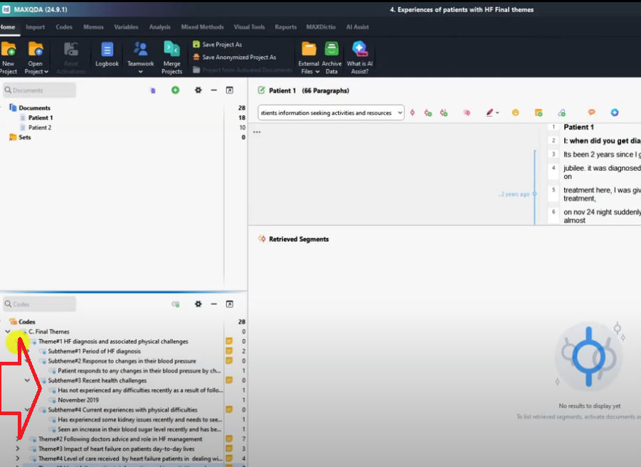
The first thing that I want to tell you before we start the visualization is that we need to assign a specific color code to each of our themes.
Sometimes we can even assign color codes to sub themes and so on and so forth.
You can see by default all the themes are light blue.
I like to assign contrasting colors to each theme so that our visualization will make sense because the colors will represent the themes.
So how do we do this?
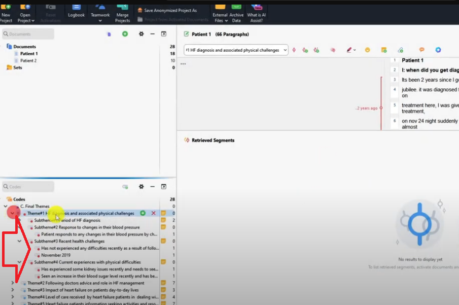
Under this theme, if I right click and choose the color red you can see all the themes and sub deems are red.
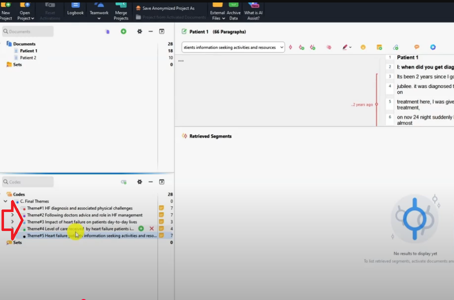
Then I right click on the second theme.
I choose the second color purple.
I select the third theme and I choose the color light blue.
Then I select the fourth theme and choose the color green
And I select the fifth theme and use the color black.
So you can see all the theme have different colors.
Code matrix browser
Now we can go and do the visualization.
Let’s start with the first visualization that we are going to do which is code matrix.
Now let’s go to the visual tools in MAXQDA.
Before I start visualizing, let me activate both transcripts and all the themes.
I activate by pressing CTRL and clicking on my mouse.
So CTRL then left click on mouse to activate all the themes and the two files so that we can visualize everything.
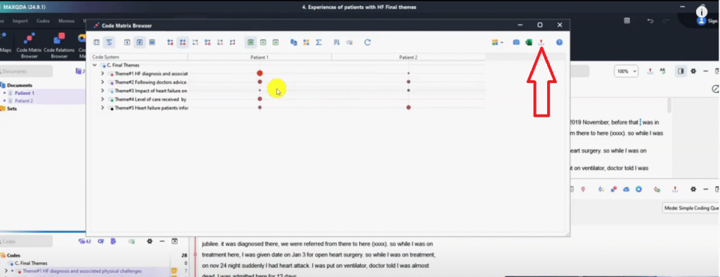
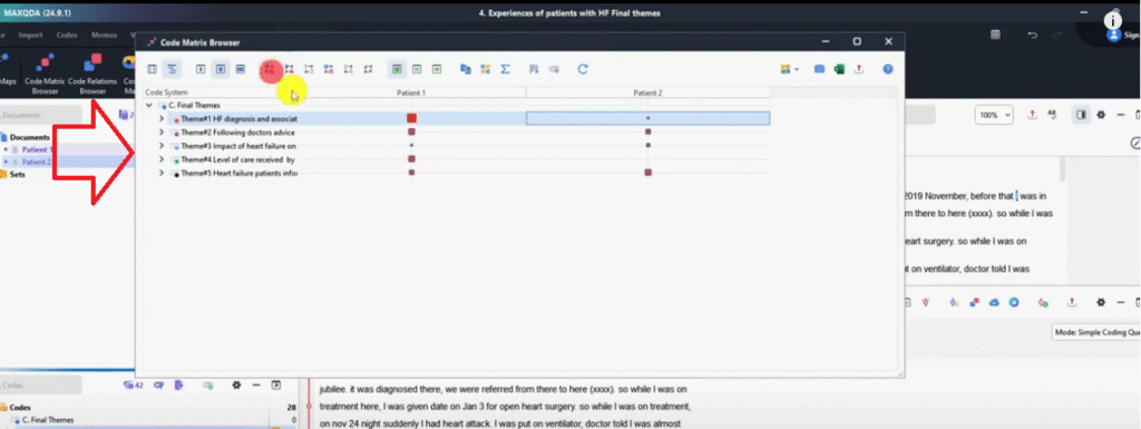
Let’s go now to the code matrix browser and click okay.
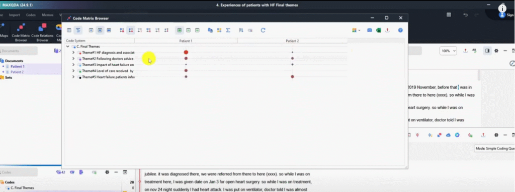
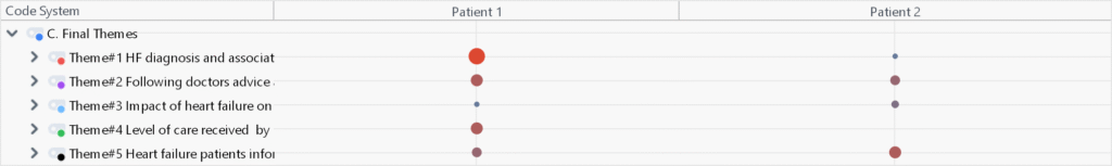
So from this you can see by default it’s on this function which shows that display nodes are circle.
So nodes are like the codes.
What does this tell us?
That the first theme patient 1 contributed a lot of information to the first theme.
That’s why the circle is so big.
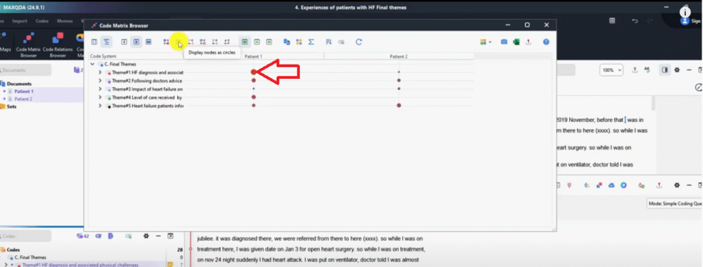
And Patient two contributed less information to the first theme so small dot.
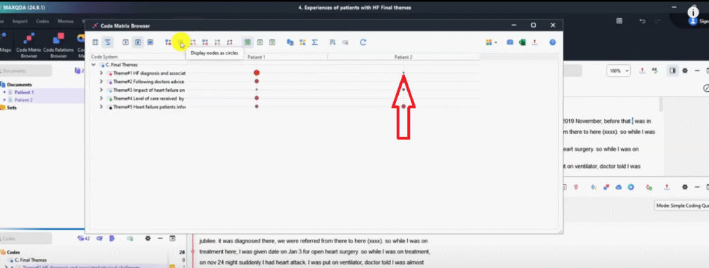
Theme two who contributed more?
I think it’s kind of equal but we can see it’s like Patient one also contributed more to theme two
Theme three both less but patient one contributed very less to theme three.
So that’s how you can know which participants contributed more to a given theme.
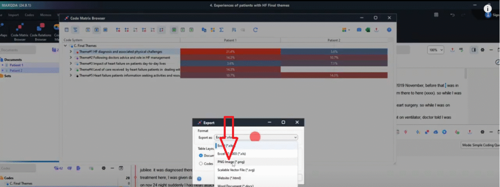
We can export this by pressing export.
We can save this as code matrix browser.
Let’s save so that we can go and check that in our folder.
So this is what we just exported.
I open it basically that’s what we get.
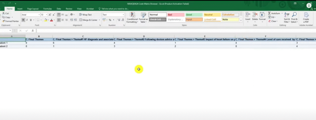
When we export in Excel format, we get numbers but let’s export in a different format.
To get the visual we just export.
Then here we choose PNG image and click okay.
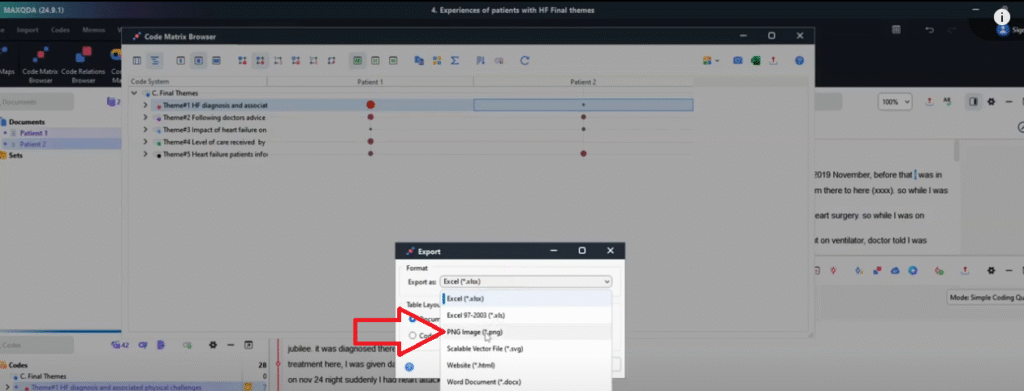
And then we save that because that’s better than using numbers.
We are visualizing so we need visuals.
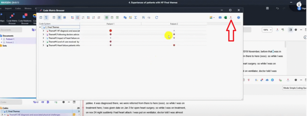
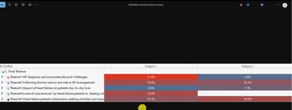
You can see what we just exported.
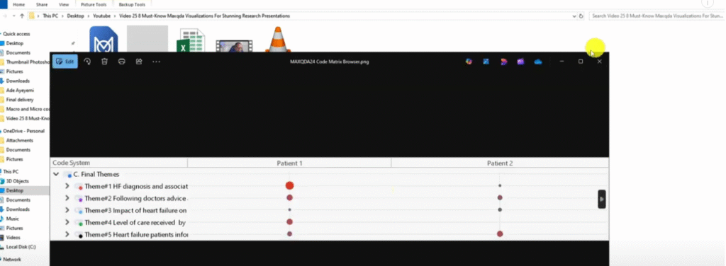
You can use this in your findings report.
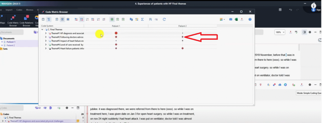
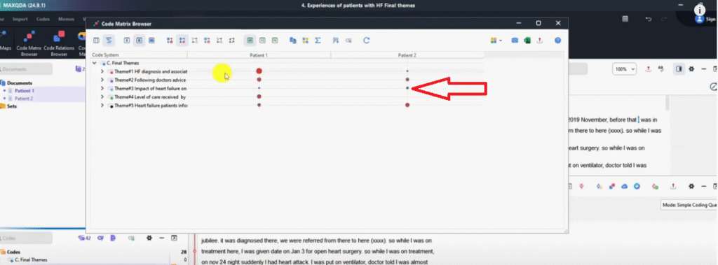
You can see it shows the prominence of themes or how much information a given participant contributed to a given theme.
Another thing that we can do is to change the formatting.
So if I click on the first button, we can use squares if you like squares.
If I click on the third one we can use numbers.
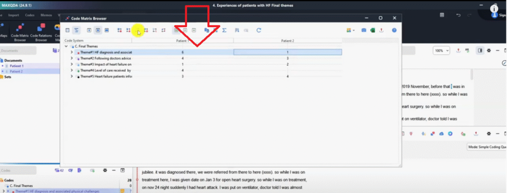
This is the one we exported.
Fourth one we can use a heat map, it shows in terms of colors who contributed more to a given theme.
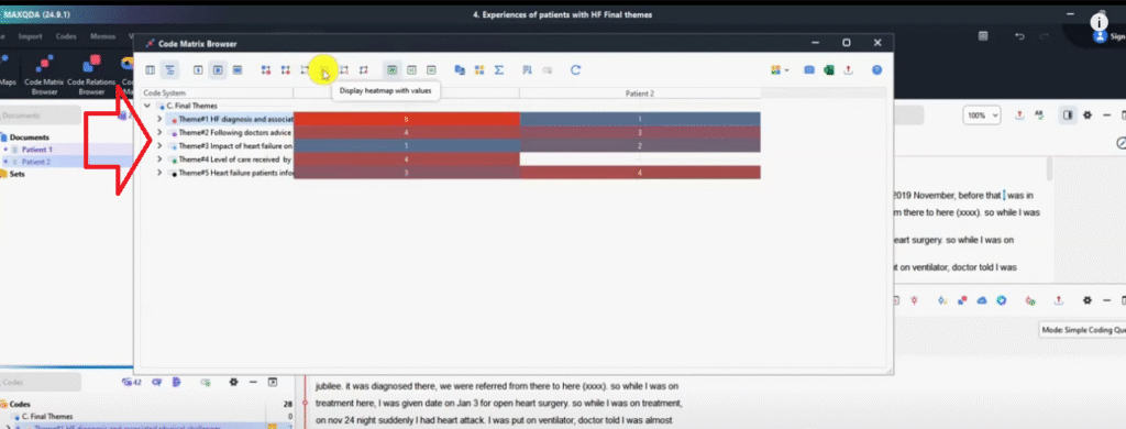
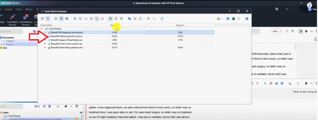
Then we can use percentages.
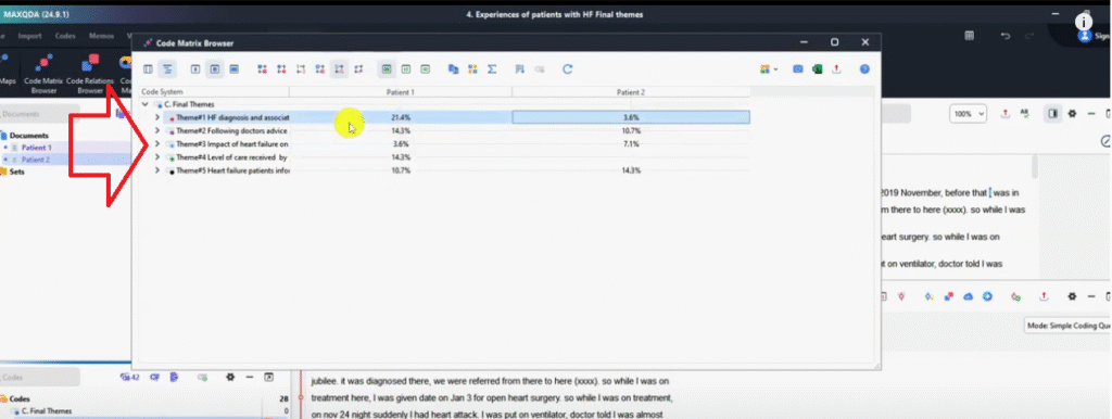
So patient one contributed 21% and patient two contributed 3.6% to that theme.
Following doctor’s advice and role in heart failure management, Patient one contributed 14.3% and patient two 10.7 and so on and so forth.
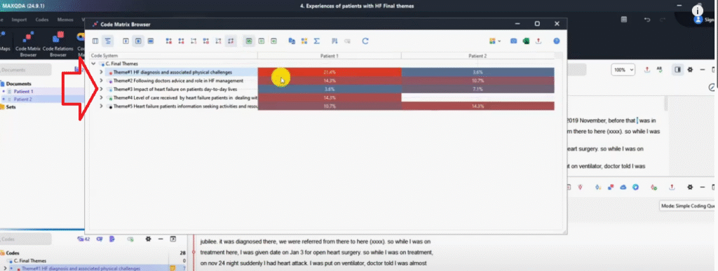
We can click another button the third one that shows the combined heat map and percentage.
Remember, if you want to export this again we just go and select PNG image.
PNG is the best because it’s an image format.
If you save this, you can go and check the heat map and use that to explain in your findings report.
That’s a code matrix browser which we can use to determine the prominence or the amount of information certain participants provided related to a given theme.
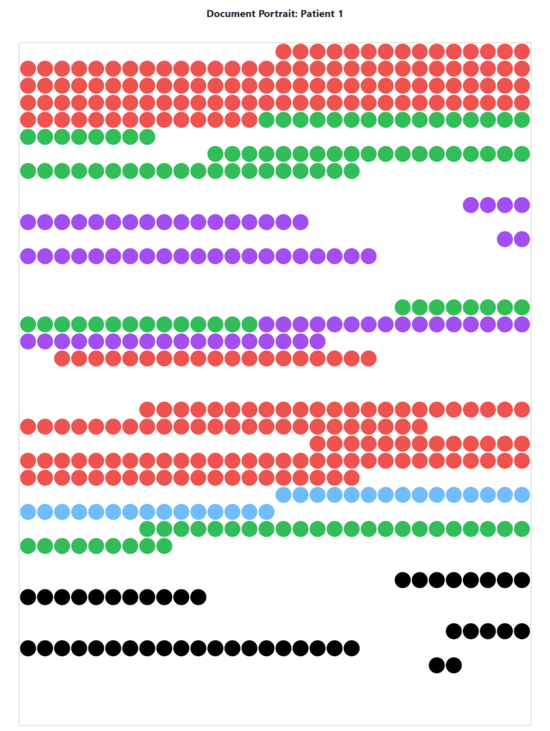
Document portrait
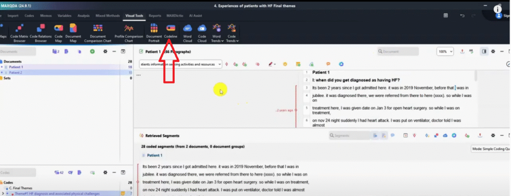
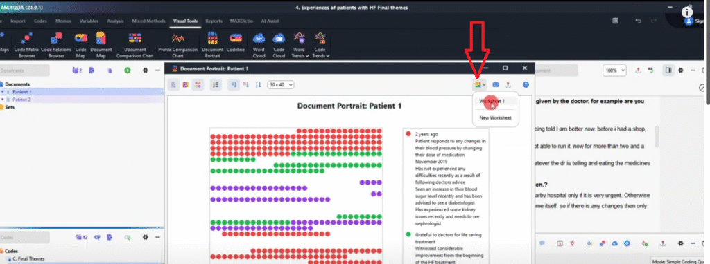
Let’s look at another way to visualize in MAXQDA, which is using the document portrait.
Remember, I’m on visual tools.
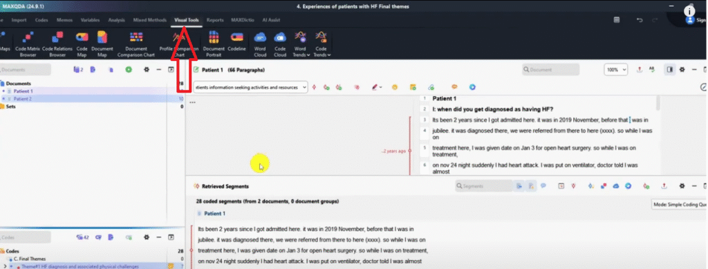
So I got to document portrait.
Only for activated codes.
clicking on my mouse.
So I click on yes.
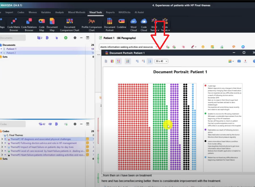
Look at what we can visualize.
Let’s tinker with these buttons.
Let’s work with them one by one.
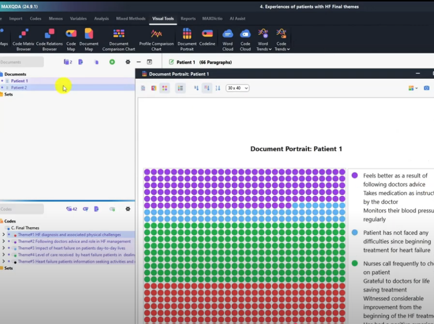
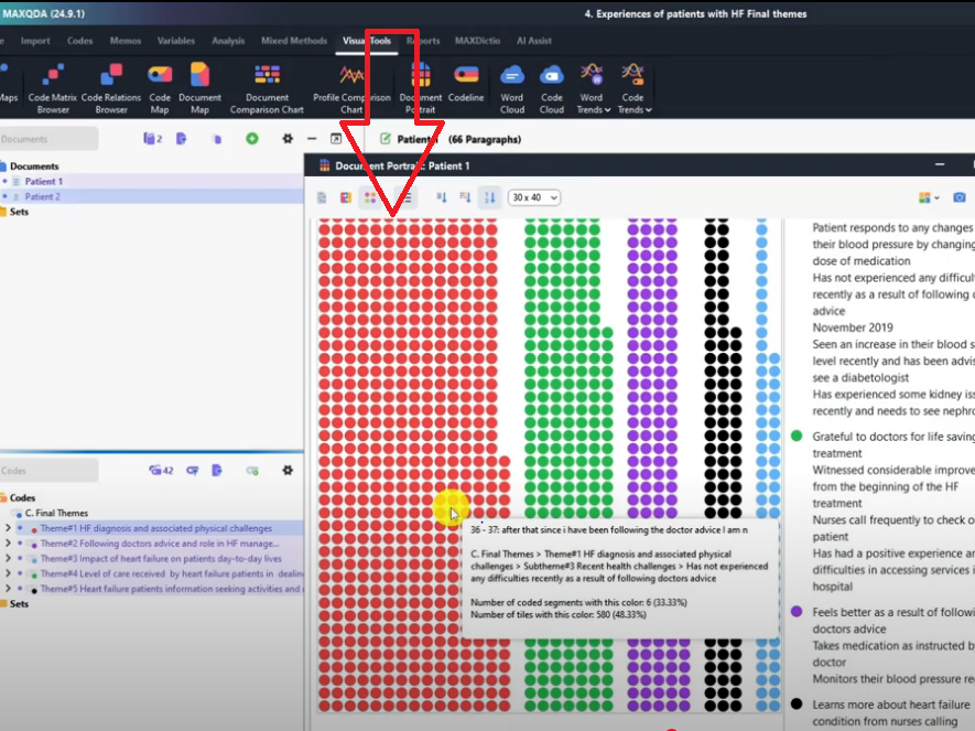
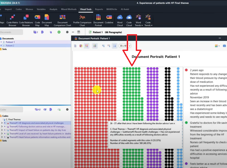
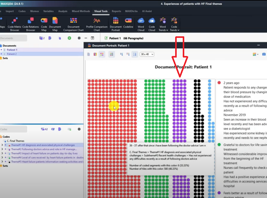
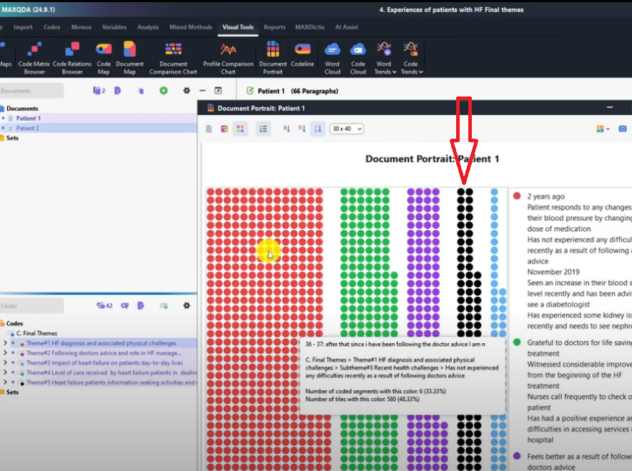
The default option is visualize the entire document.
What do this mean?
Look at the red remember red is for theme one.
So theme one in patient one, remember it’s document patient one, one document at a time.
I could have activated both documents if I wanted but now I’ve activated only one.
So for document one, theme one comes from the first section of the document.
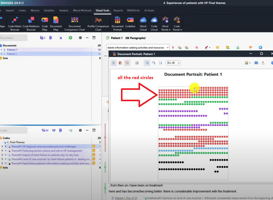
That’s why you see it labeled as red.
The green theme, theme four comes from this section.

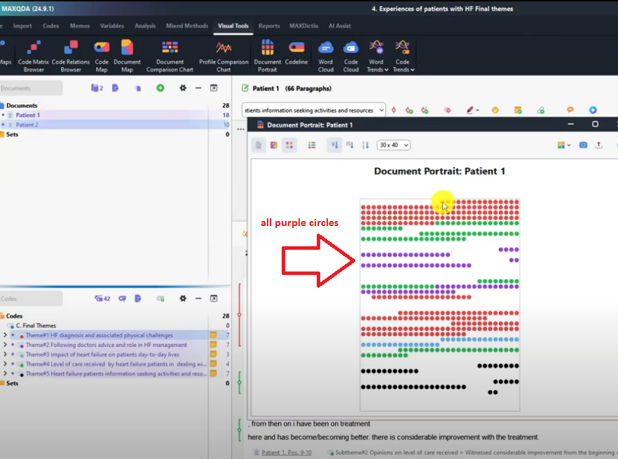
Purple theme, if you remember following advice and role of HF in management is located at this section.
So basically this document portrait shows where the themes came from in the original transcript.
And it shows that as a visual.
Remember we can always export this by going to PNG image and saving that. Let me show you what we have here.
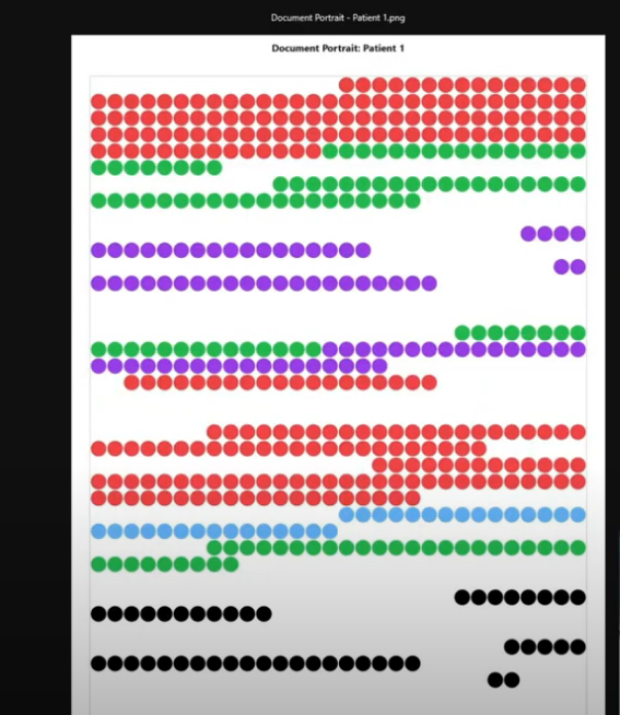
So that’s document portrait for patient one.
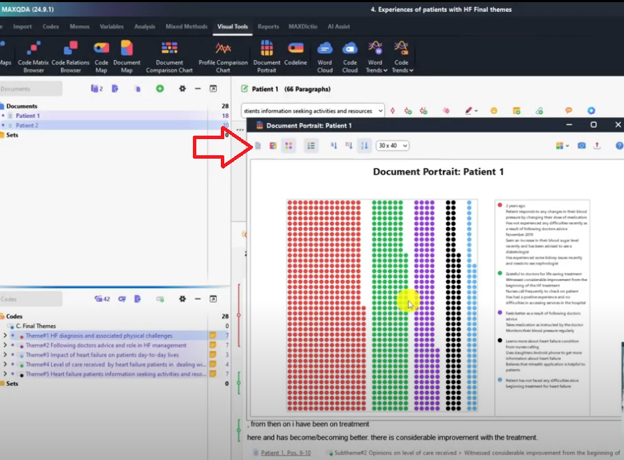
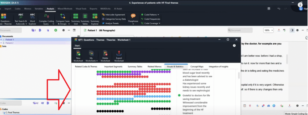
Another option here display legend.
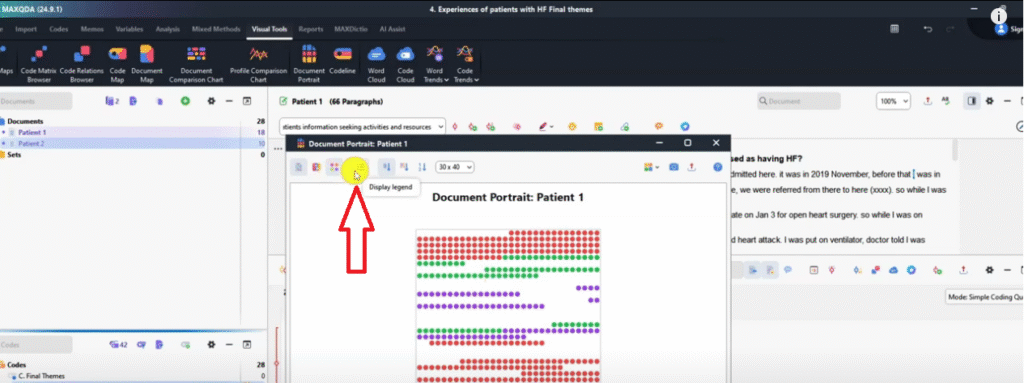
This one shows the original codes in side to side.
Basically it shows where the codes came from.
There’s another one here which shows ordered by colors.
This one focuses more on the codes.
The codes are ordered by colors but the default is the best.
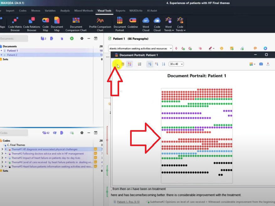
And this one shows order by color frequency.
It shows from which section of the transcript you extracted the most themes.
Like the red theme, theme one dominated with a lot of information.
Followed by the green theme.
Followed by the purple theme.
Followed by the black theme.
We got the least information from the light blue theme which is impact of heart failure.
Code line
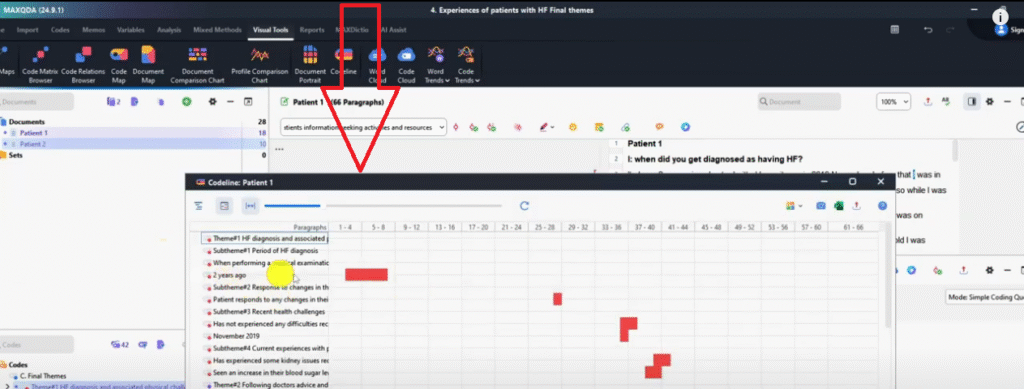
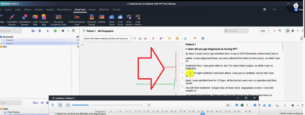
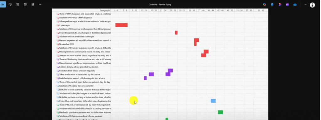
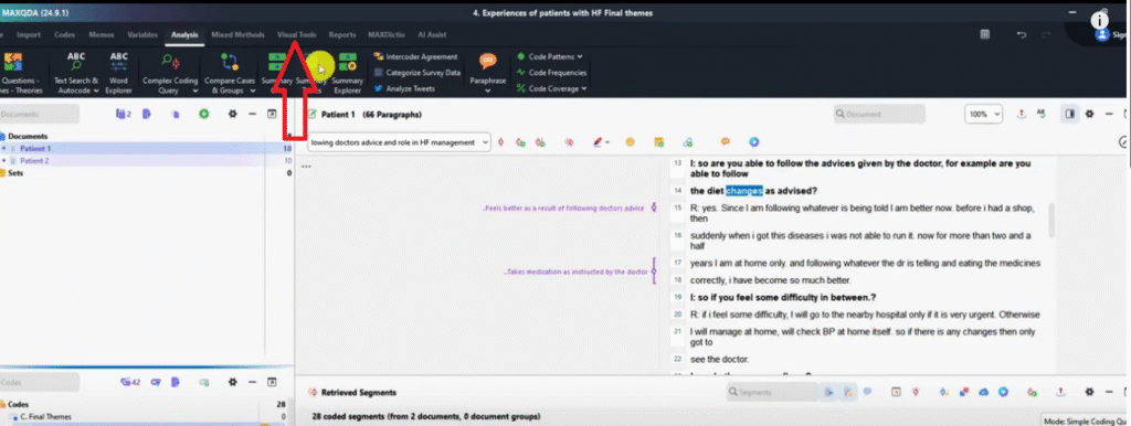
Another visual that we can make in MAXQDA is a code line.
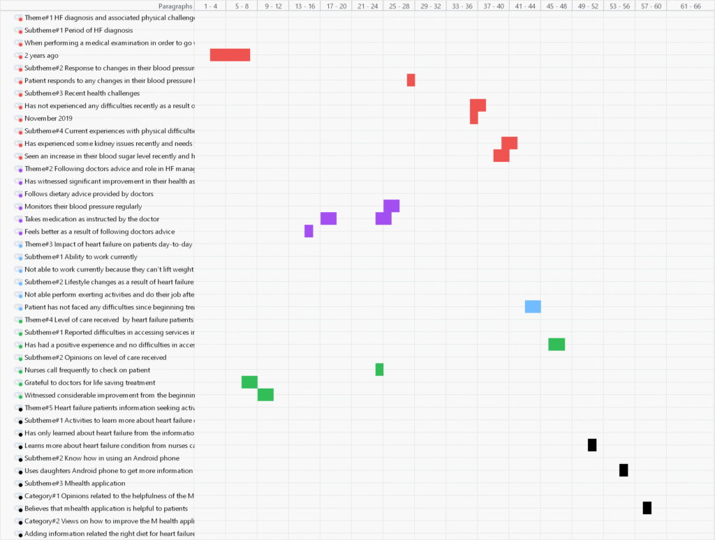
Click on the code line.
I’ve activated patient one and patient two.
So the code line simply shows where the codes came from in the transcript.
For instance, this code two years ago, we can see in patient one document it came from between sentence number four and sentence number eight.
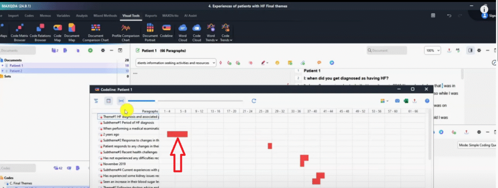
That’s where it’s located.
Another code, patient response to any changes their blood pressure came from sentence 28.
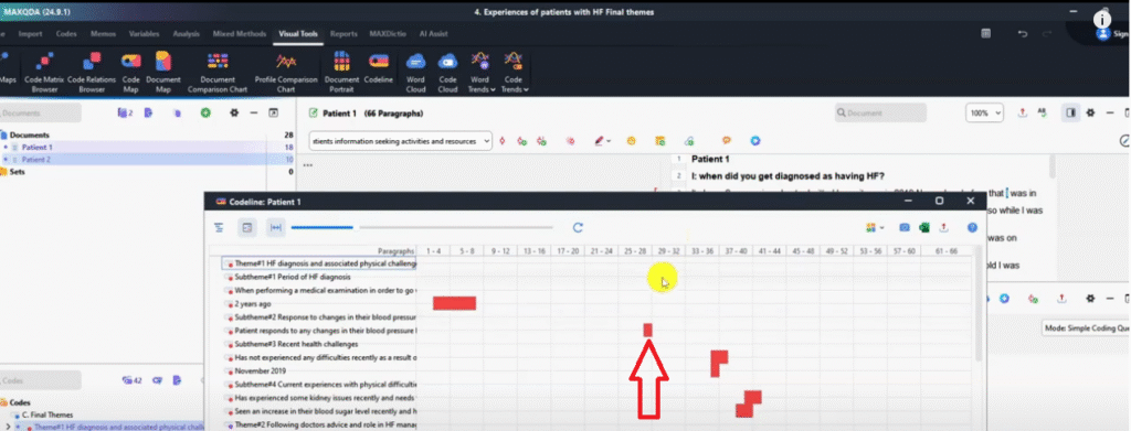
These two codes came from both sentence 33 and 36.
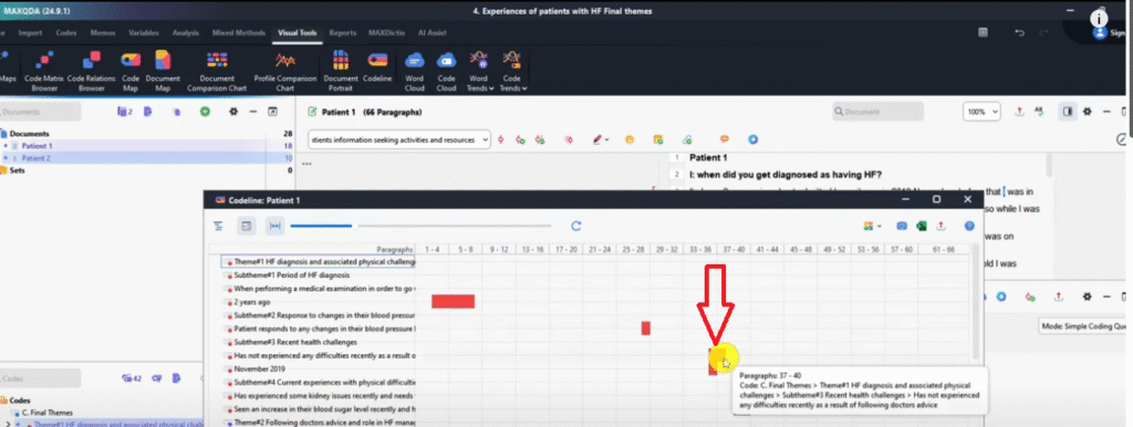
This is a code line that shows the areas that were coded in the transcript and the specific sentences.
Because if you look, you’ll see MAXQDA numbers and the sentences that we are coding, so we can be able to locate where the codes came from and visualize that.
And then export it as PNG image and save that.
We can be able to use that in our findings report.
So that’s called a code line.
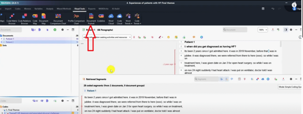
Document comparison chart
Another visual that we can be able to make in MAXQDA is the document comparison chart.

Remember, I’m in the visual tools and I’ve activated all the themes and I’ve also activated both the transcript.
So two transcripts activated.
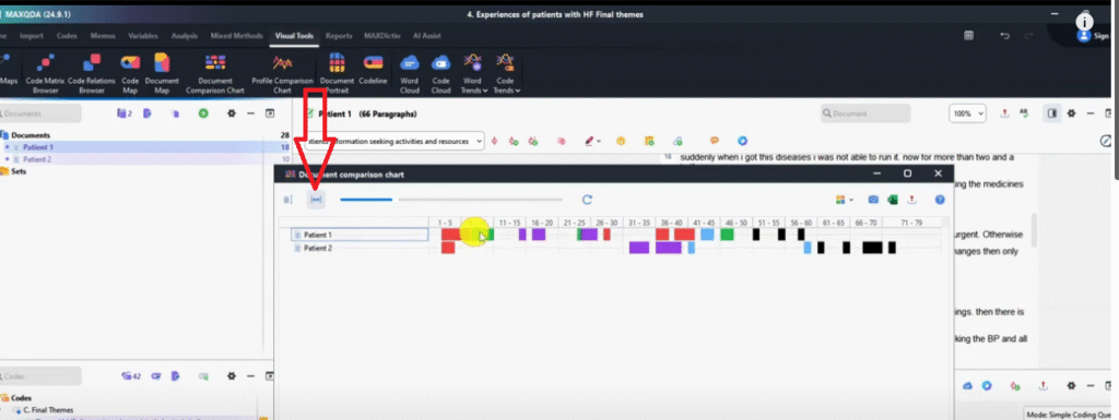
Let’s go to document comparison chart.
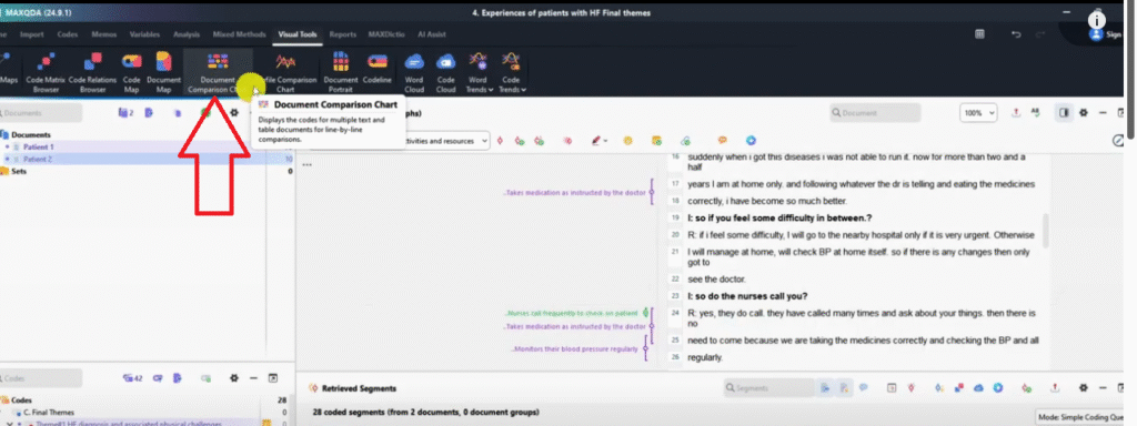
Only for activated codes and click okay.
So this compares the coding in the different documents.
If I click on the second option which shows fit to window so we are able to see everything.
We can see for instance, patient one provided information related to theme HF diagnosis and associated physical challenges between line five and six.
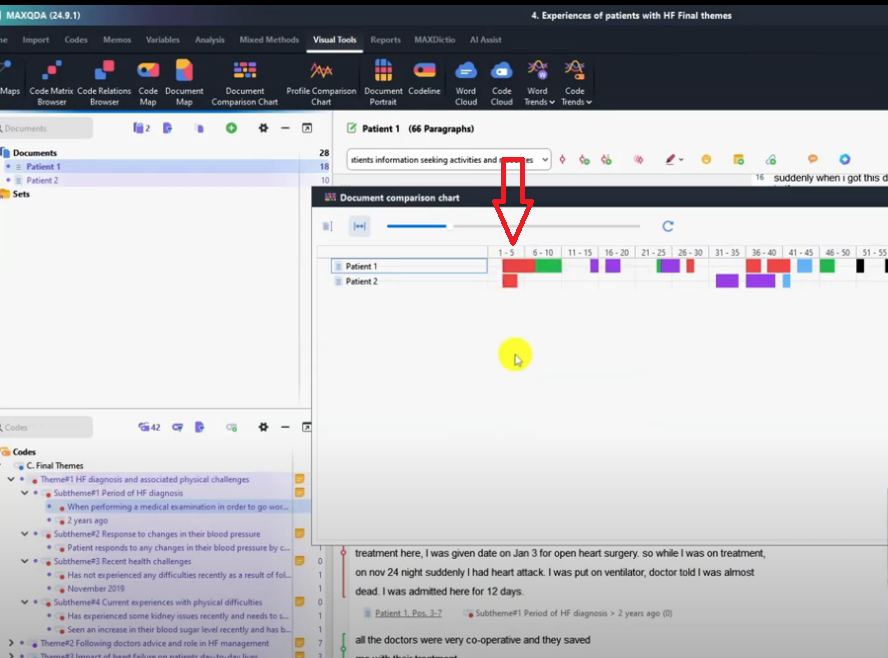
We can see the concurrence of themes across different documents.
For example theme one exists in the same section across patient one and patient two.
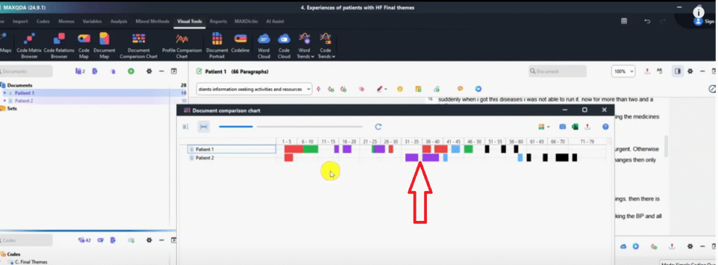
We can see that the other themes might not co-occur.
For example, the purple theme is following doctor’s advice and role in heart failure management.
The purple theme in patient two does not coincide with what patient one said.
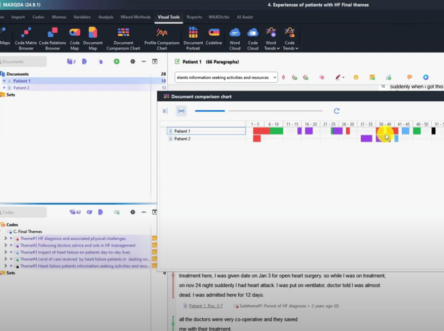
So these one shows the differences in the areas that the interview participants provide information.
And again we can be able to export this and we can export it as a PNG which is an image.
And we can be able to save that as document comparison chart.
So we use this to look for the co-recurrence of themes across different participants.
Word cloud
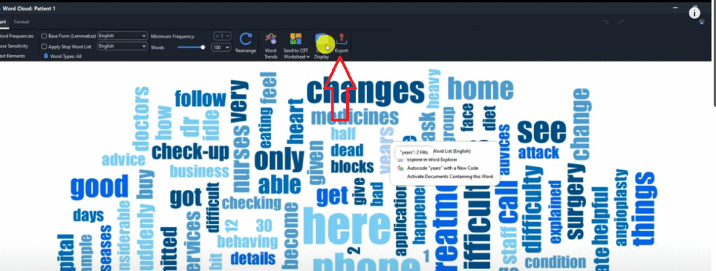
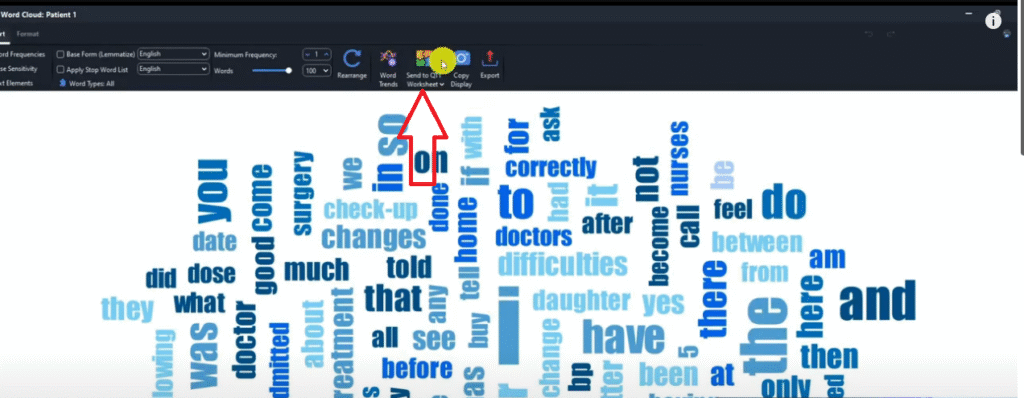
Another visual that we can be able to come up with in MAXQDA is the word cloud.
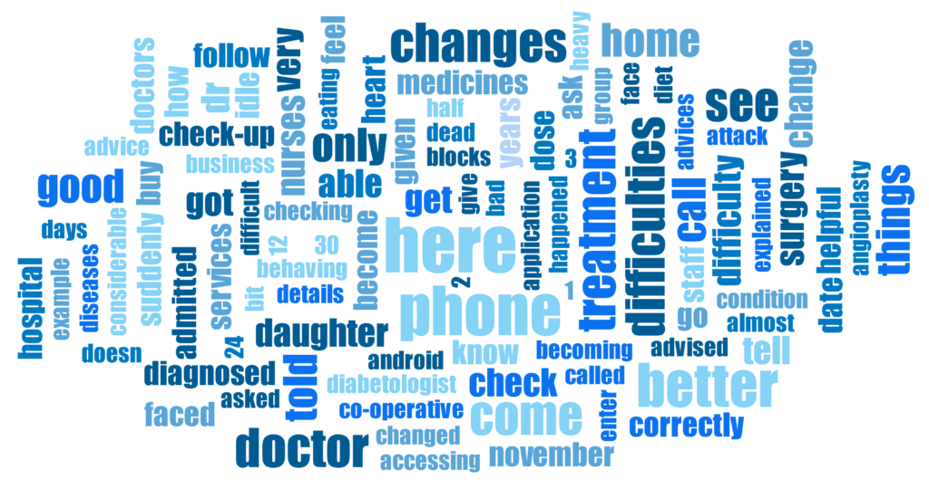
So I am in the visual tools, i have activated both the transcripts and all the themes that I had.
Then I click on the word cloud.
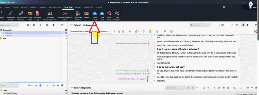
We can only draw a word Cloud for the transcripts.
So let me drag and drop this patient one.
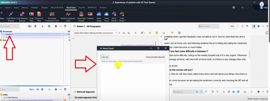
Let’s click okay to see what was this guy talking about?
And you can see the word cloud here.
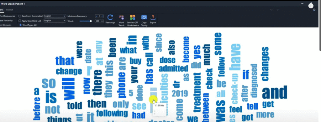
We can always remove what we don’t like in the word cloud.
For example ‘I’ I can add to stop words list.
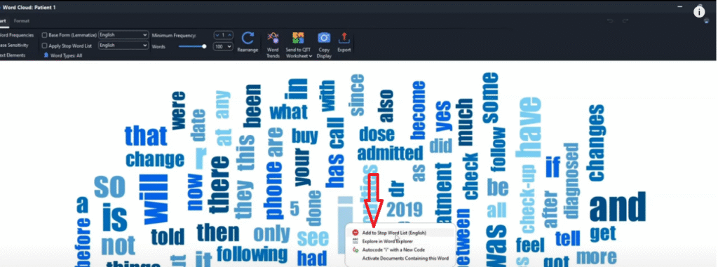
Let’s say I don’t like the word ‘your’ add to stop words list.
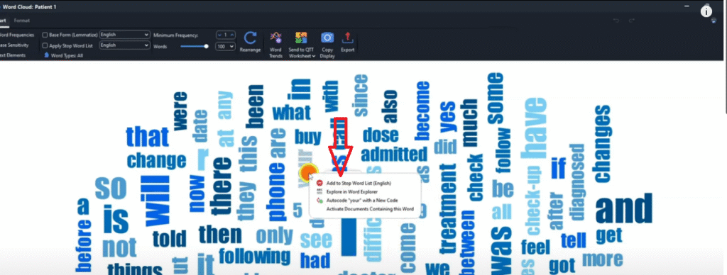
And so on and so forth.
And when I’m done I can do something we call rearrange so that they can apply the words that we just removed in the stop words list.
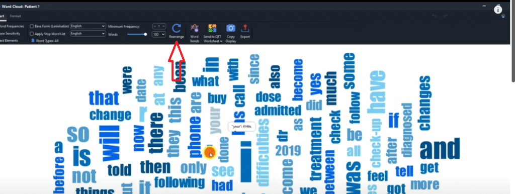
So the workload is loaded.
nd I can go to export and of course I can save it as a PNG.
Code cloud
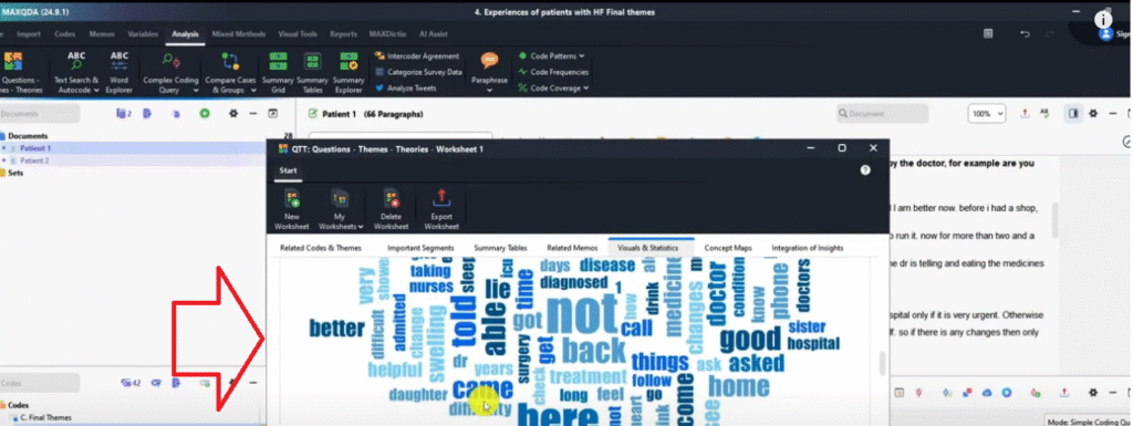
Another visual that we can make in MAXQDA is the code cloud.
Let’s do code cloud, click patient one and two.
Then click on the code cloud icon.
Let’s click okay and see what will happen here.
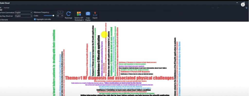
You can see we can get our word cloud for all our themes, all our sub themes and our code cloud for that matter.
And we can be able to use that as a visual tool in our reports.
So that’s how you visualize using the code cloud in MAXQDA.
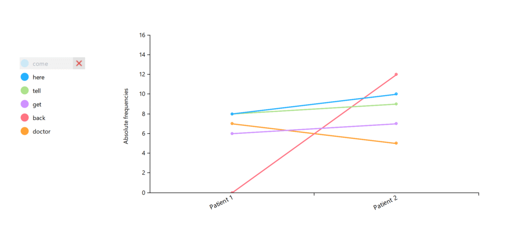
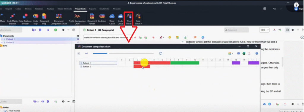
Word trends
Let’s look at another way to visualize in MAXQDA which is using word trends.

So I want to go for multiple documents ‘ cause I want to select documents and select both patient one and two and see.
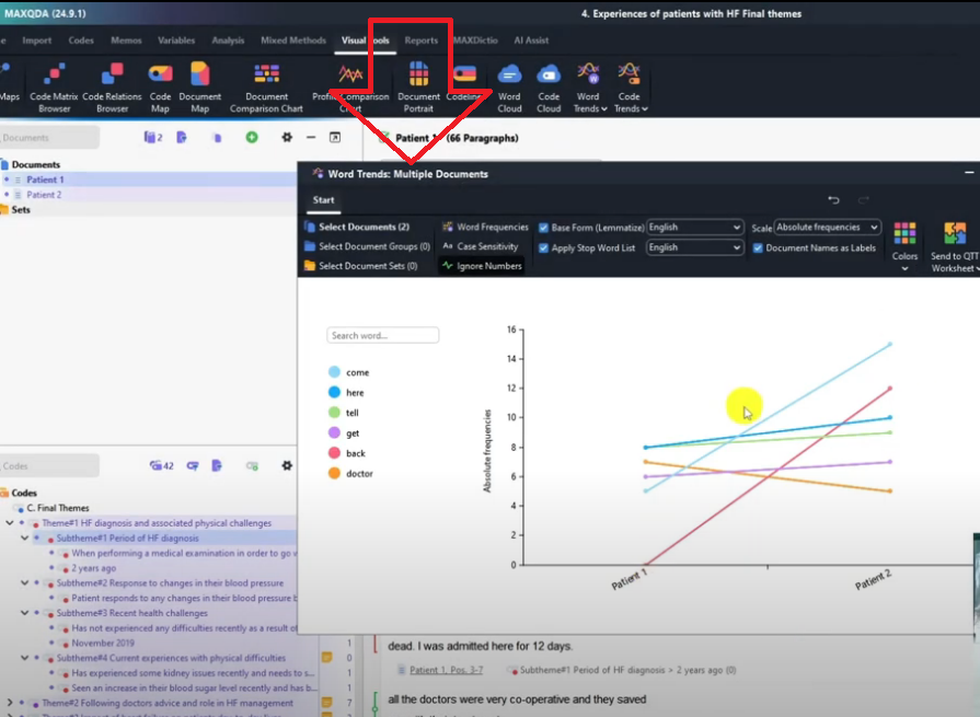
So for patient one, if you look at a certain issue for example this is the word come
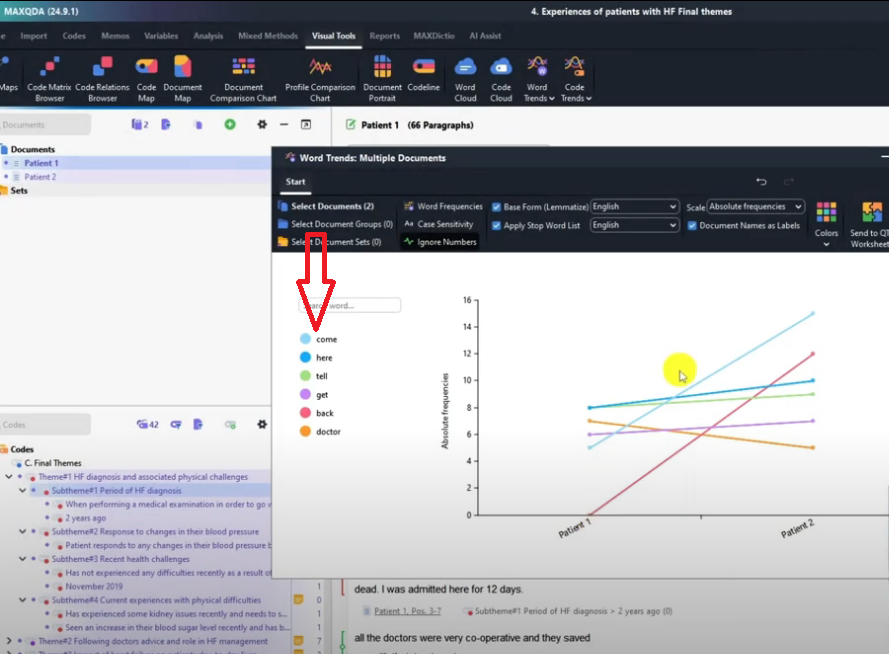
So if you click on it you can see which participant talked more about a given word.
So we can target specific words and see their prevalence or how many times a certain participant mentioned them.
For instance, participant named patient one mentioned the word here, less times compared to participant two.
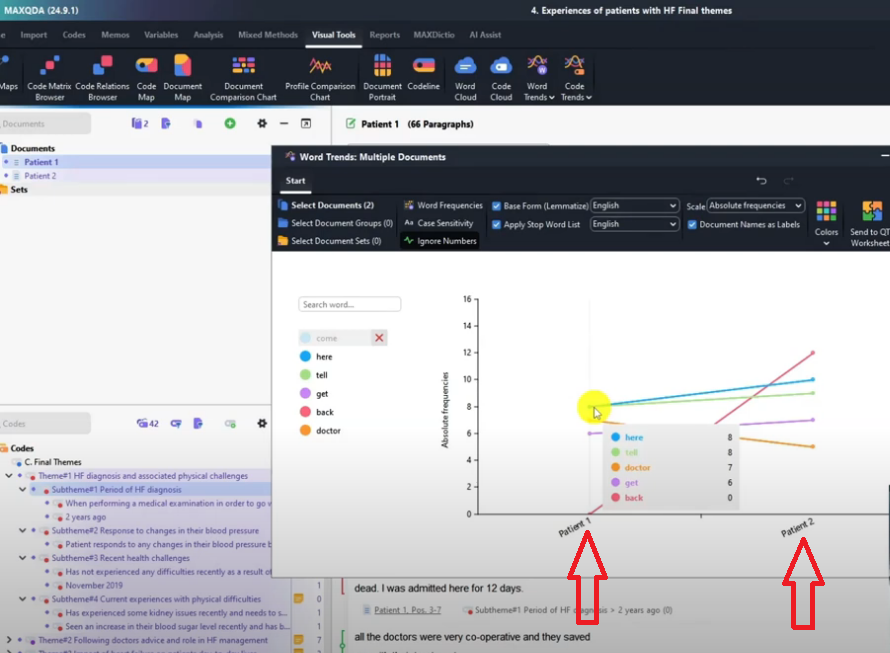
On the other hand, patient two mention the word back 12 times and patient one mention it zero times.
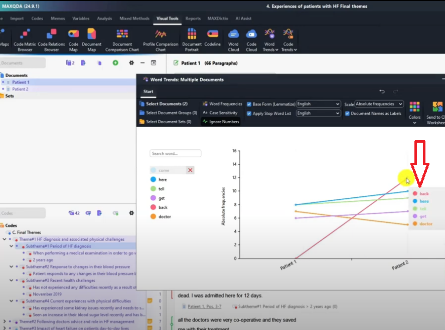
So this is what this visual shows you, specific words that you think are important in your analysis.
You can compare the occurrence across different participants.
Again, we can always export these and save that as a PNG image.
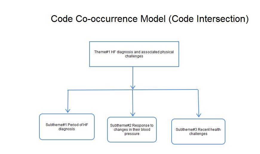
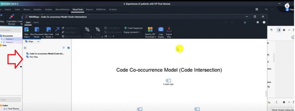
Max maps
Another visual that we can get from MAXQDA is max maps.
So if you click on max maps we can be able to visualize even draw charts inside MAXQDA.
We can draw circles and rectangles and all that.
Let us draw rectangles.
See this is the rectangle tool, I can draw here.
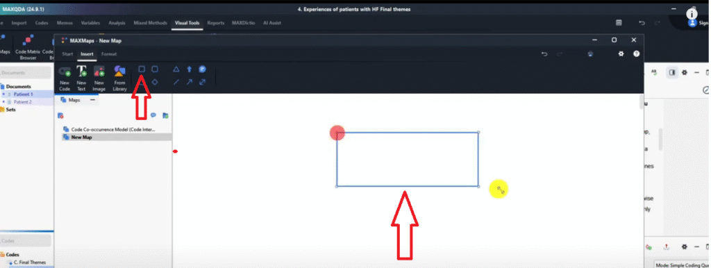
Remember, I can always even add new text and call this the theme 1 just like we would do in Word.
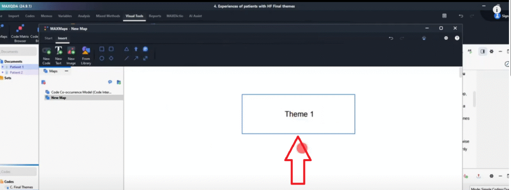
Then under this I want to draw an arrow or a line a simple line.
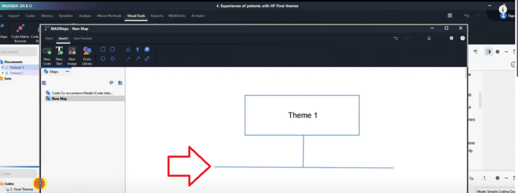
How many subthemes are in my main theme mode?
1,, 2, 3, 4. So I can put 4 lines or 4 arrow rows.
And I can come back and now have rounded rectangles.
Then I can export this visual and that’s how you use max maps.
That’s another way of visualizing in MAXQDA.
Bonus
Now there are two documents that can enhance your work after conducting qualitative analysis in MAXQDA.
The bonuses that I have for you.
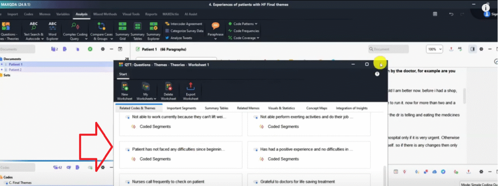
One document is called the QTT worksheet.
So if I go to analysis.
And go to question themes and theories.
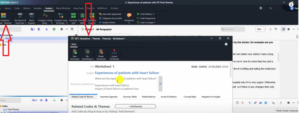
This is our worksheet where we can add all our information.
This is information I’ve added before.
So if for instance we go to visuals.
And we’ve been able to do a document portrait and say yes.
And now instead of exporting you see a certain icon here sent to QTT worksheet.
Let’s go to send.
So if I close this and I go back to analysis and click on QTT worksheet I can see my worksheets here.
You can see the latest thing I sent here.
Let’s add another visual.
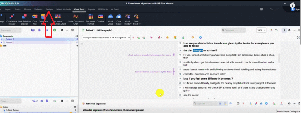
So go to visual tools. Let’s do a word cloud for Patient one and send it to QTT worksheet.
So that’s the word cloud sent to QTT worksheet one.
So if you go back to analysis
Go to QTT worksheet you can see everything that I’m sending here.
I’ll export this QTT worksheet and I will have everything that I exported in one single document.
You can see initially I had put codes and themes.
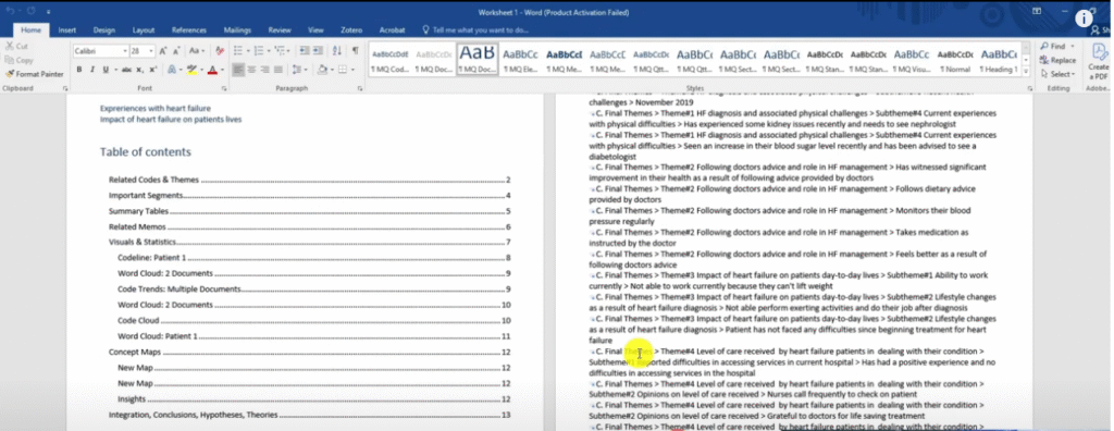
It’s a very long report with everything that we did in MAXQDA.
So this can enhance your work and it’s good to use the QTT worksheet to export everything in a single document in MAXQDA.
Now the second bonus that I want to give to you is to show you how to export the coded document in MAXQDA.
So that you can show the codes and where you are tagging the information.
So how do we export the document when it’s coded?

In MAXQDA we go and use the export button here.
And then click on print.
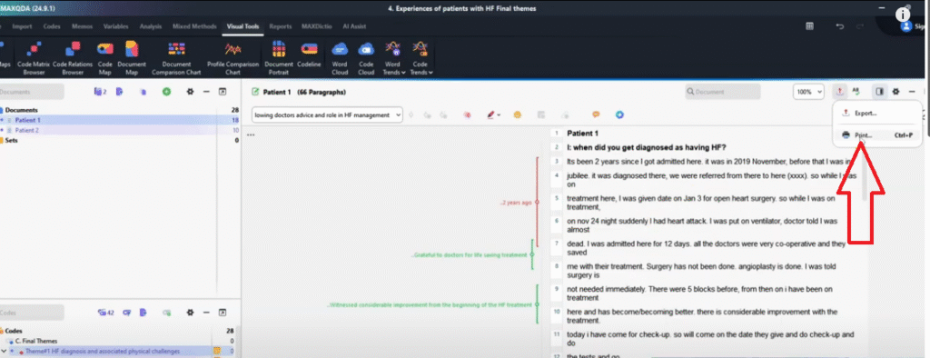
When you click on print, Microsoft print to PDF is a default.
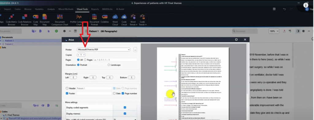
And that’s okay
And I want you to look at that document.
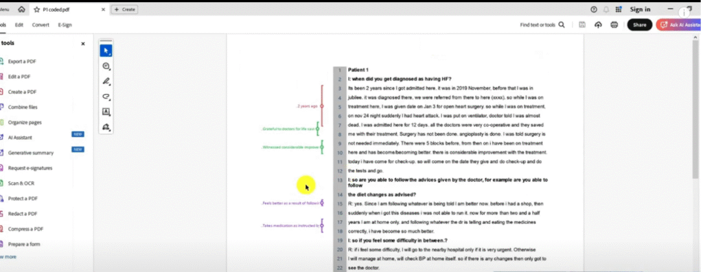
We can export a coded document and attach it to the appendix of our dissertation or thesis.
So basically this is how we export the coded document in MAXQDA.

