Last Updated on 1 month ago by Bernard Mugo
MAXQDA visualizations are one of the most underused features in the software — and one of the most powerful. In this guide, I’ll walk you through 8 visualizations you can produce directly in MAXQDA and show you exactly how to use each one in your qualitative findings report or research presentation.
I’ll also cover two bonus exports that can significantly strengthen your dissertation appendix. The data I’m using comes from a heart failure patient interview study — two transcripts coded using Braun and Clarke’s reflexive thematic analysis framework.
- Why MAXQDA Visualizations Matter for Qualitative Research
- Before You Start: Color Code Your Themes
- Visualization 1 – Code Matrix Browser
- Visualization 2 – Document Portrait
- Visualization 3 – Code Line
- Visualization 4 – Document Comparison Chart
- Visualization 5 – Word Cloud
- Visualization 6 – Code Cloud
- Visualization 7 – Word Trends
- Visualization 8 – MAXMaps
- Bonus 1 – The QTT Worksheet
- Bonus 2 – Exporting Your Coded Document
- Frequently Asked Questions
- Key Takeaways
- Need Help with Your MAXQDA Analysis?
Why MAXQDA Visualizations Matter for Qualitative Research
MAXQDA’s Visual Tools section gives you a way to present patterns in your coded data that words alone cannot convey. Visualizations like the code matrix browser show which participants contributed most to each theme. Document portraits show where themes appear in a transcript. Word trends let you compare how often specific words appear across participants. Used well, these visuals make your findings chapter more credible and easier to read.
If you haven’t completed your coding and theme development yet, start with my complete MAXQDA qualitative analysis tutorial before working through the visualizations below.
Before You Start: Color Code Your Themes
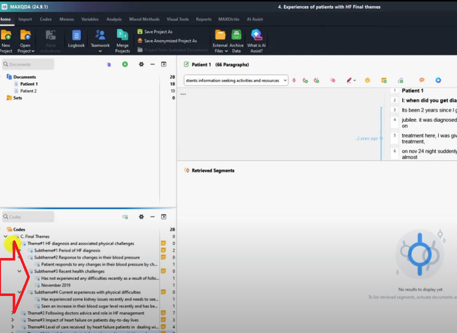
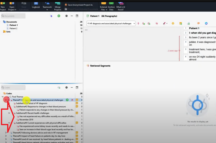
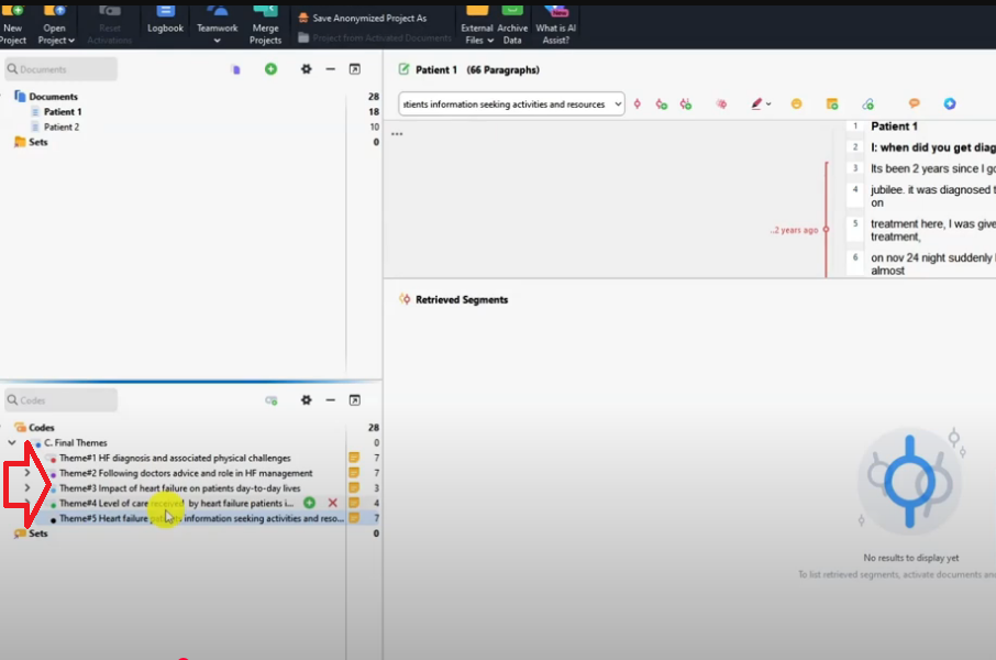
Before opening any visualization tool, assign a distinct color to each of your themes. By default, all themes in MAXQDA appear in light blue — which makes visualizations unreadable since every segment looks identical.
To assign a color: right-click on a theme in the Code System panel and choose a color. I recommend assigning contrasting colors — for example, Theme 1 = red, Theme 2 = purple, Theme 3 = light blue, Theme 4 = green, Theme 5 = black. Once done, all sub-themes under each main theme will inherit the same color, and every visualization you produce will be immediately interpretable.
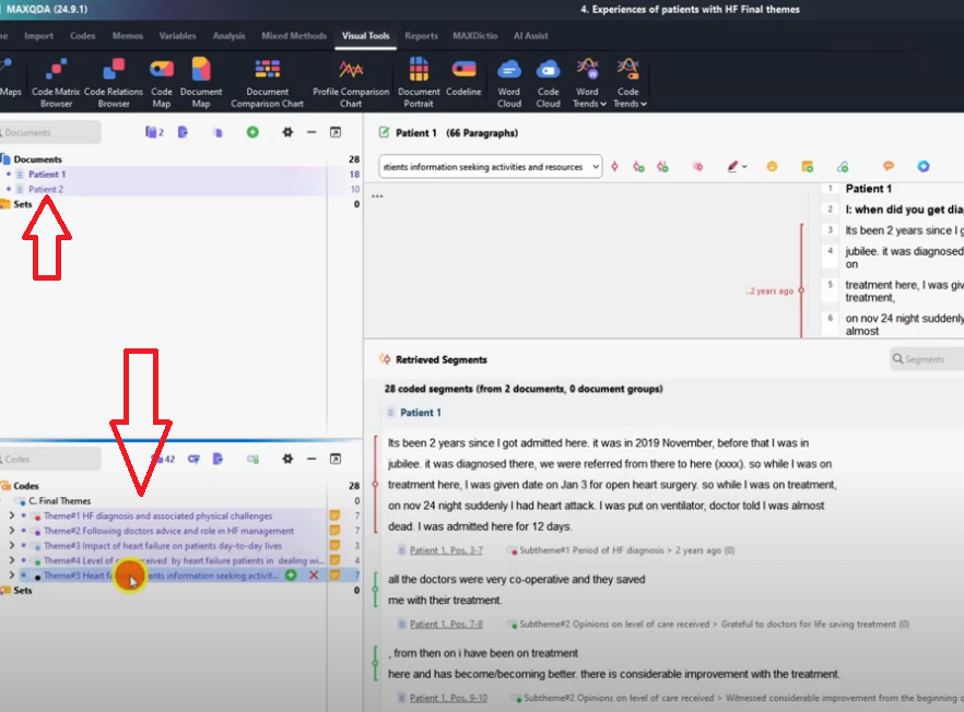
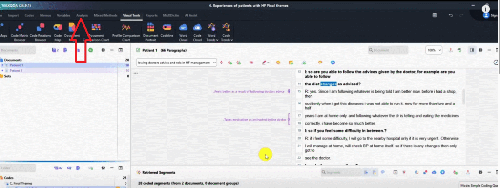
Also activate all your transcripts and themes before opening any visual tool: hold Ctrl and click each document and code to activate them. This ensures MAXQDA visualizes your complete dataset. For the full coding setup, see my guide on how to code qualitative data in MAXQDA.
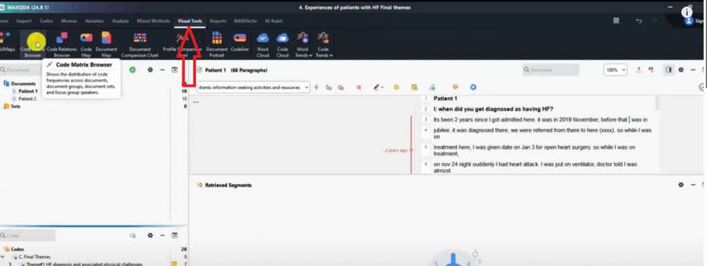
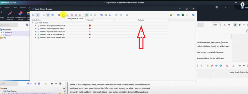
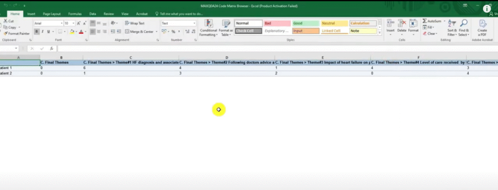
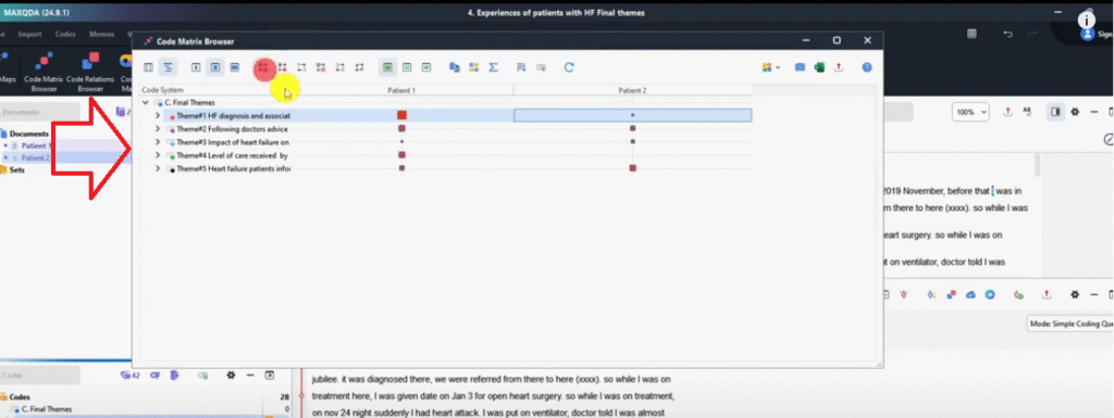
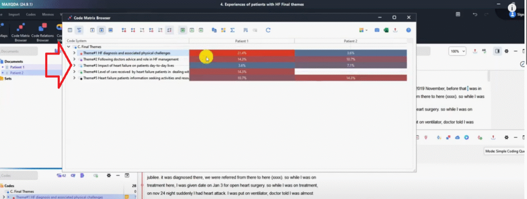
Visualization 1 – Code Matrix Browser
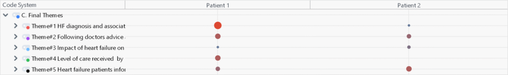
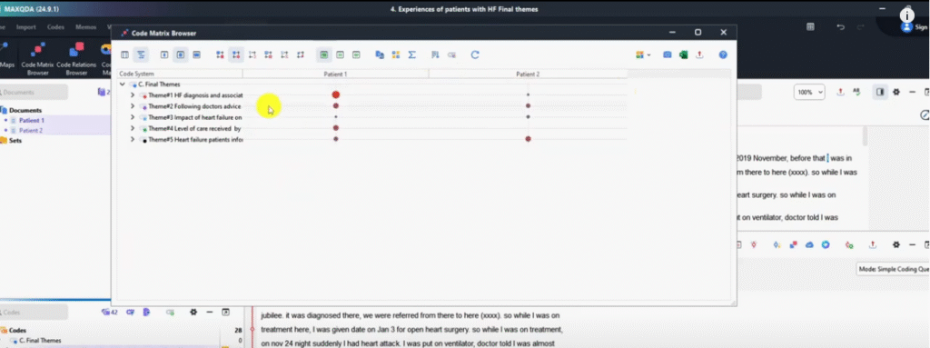
The Code Matrix Browser is a MAXQDA visualization that shows how much each participant contributed to each theme — making it easy to identify which voices drove which findings.
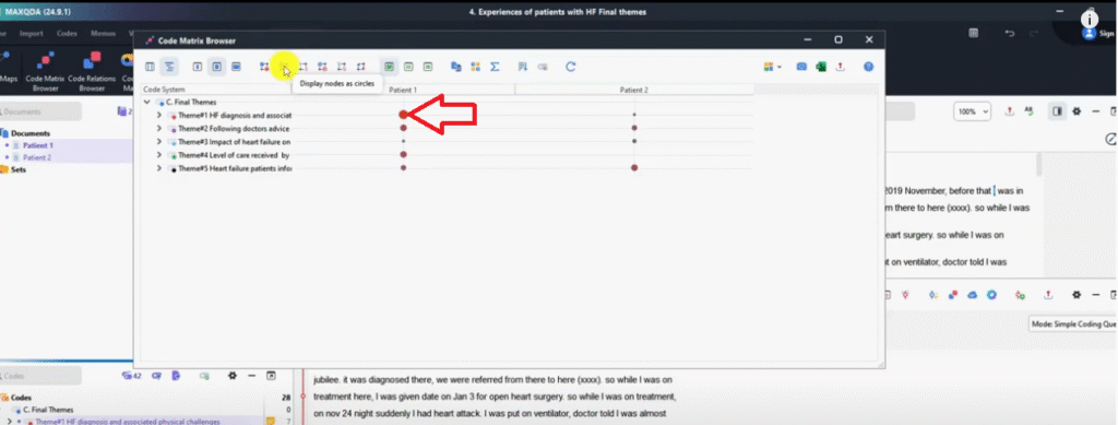
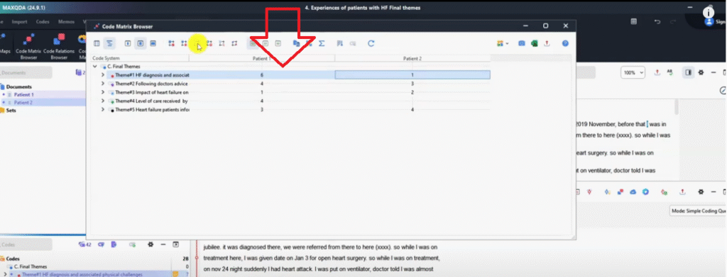
Go to Visual Tools → Code Matrix Browser → click OK. By default, nodes appear as circles: a large circle means that participant contributed a lot of data to that theme; a small circle means little contribution. In my heart failure study, Patient 1 contributed substantially more to Theme 1 than Patient 2 — immediately visible at a glance.
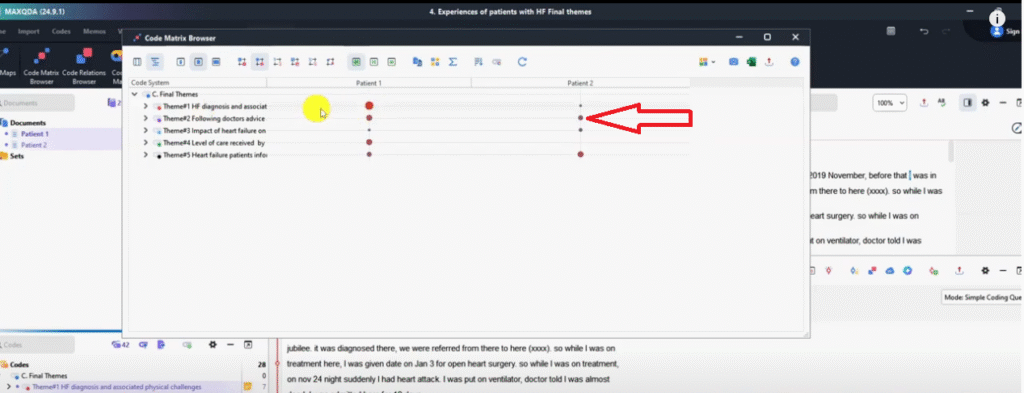
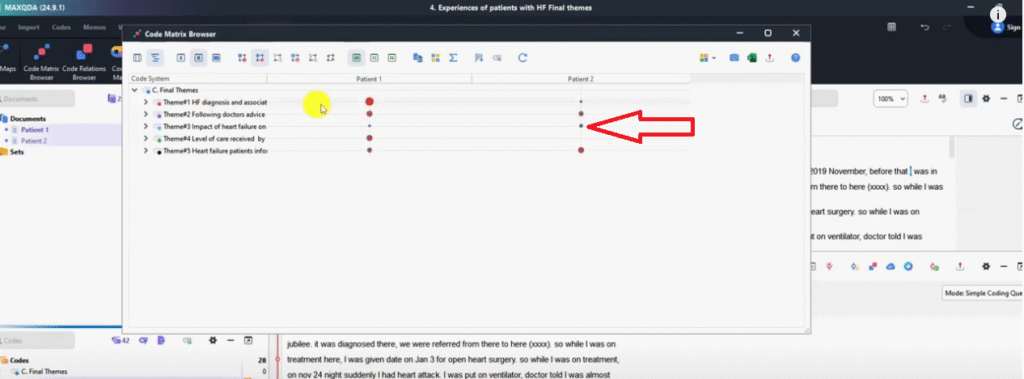
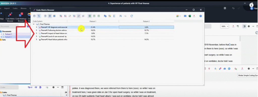
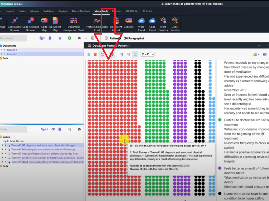
You can switch between five display formats using the toolbar buttons: circles (default), squares, raw numbers, heat map (color intensity shows frequency), and percentage view. The heat map and percentage views are particularly useful in findings reports because they give reviewers a precise, quantified picture of theme prominence.
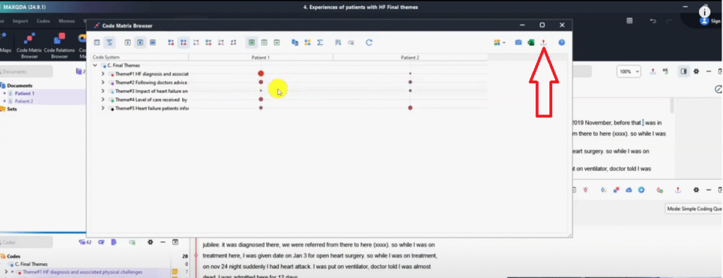
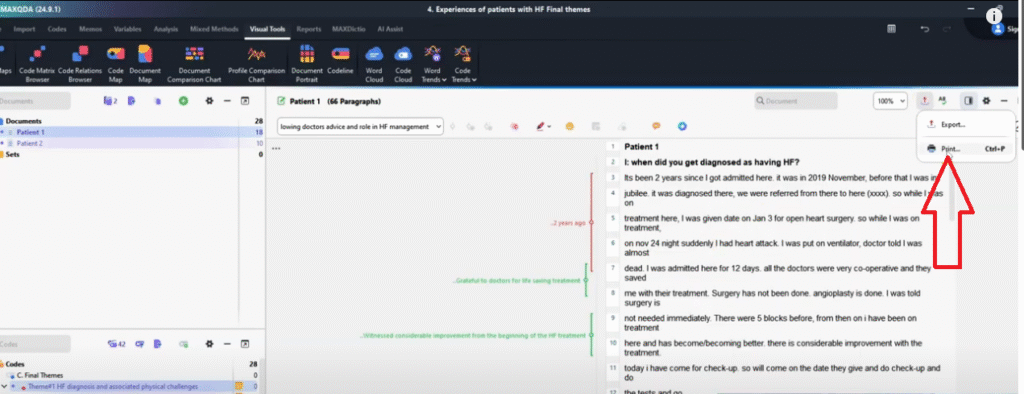
How to Export the Code Matrix Browser
Click the Export icon → select PNG image → save. PNG is the correct format for any visualization you intend to include in your findings chapter or presentation — it renders as a clean image rather than a data table.
If you export as Excel, you get raw numbers instead of the visual. That’s useful for building your own tables, but for the findings report itself, always export PNG.
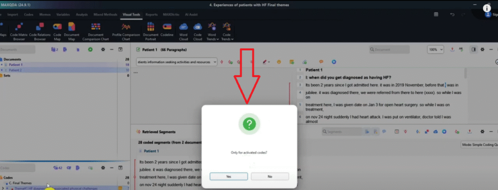
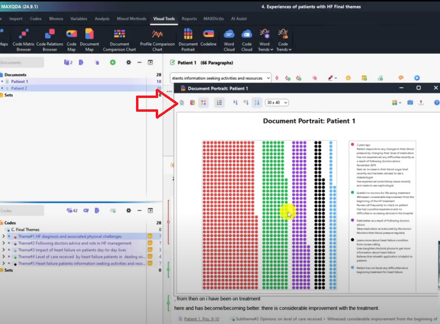
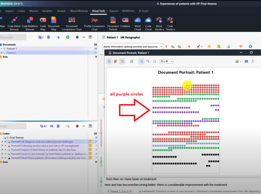
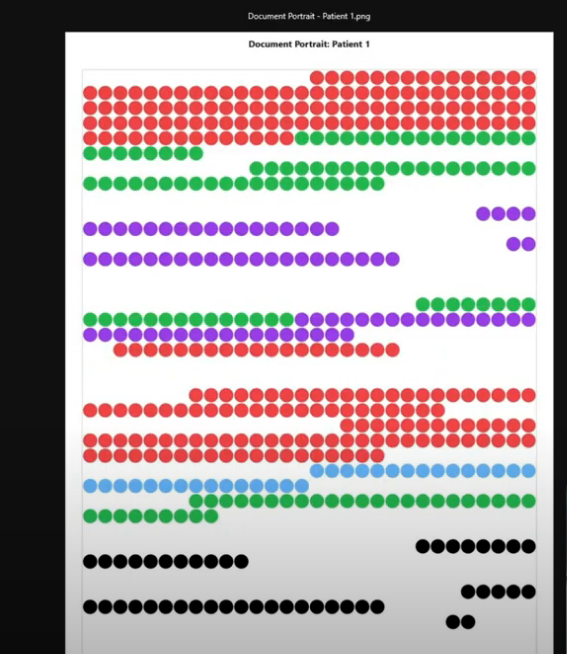
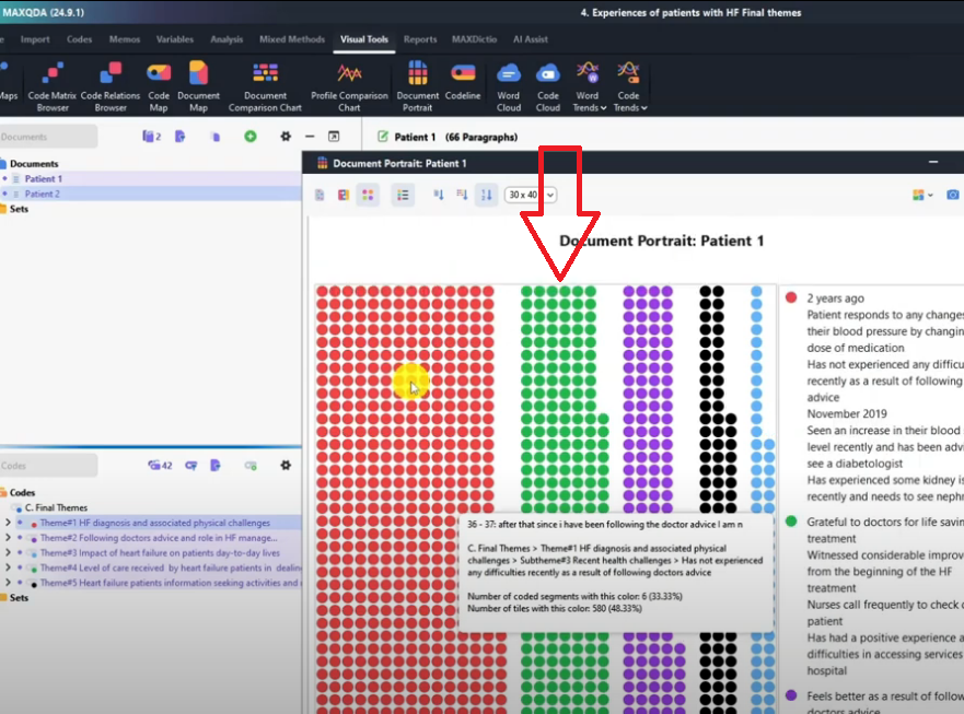
Visualization 2 – Document Portrait
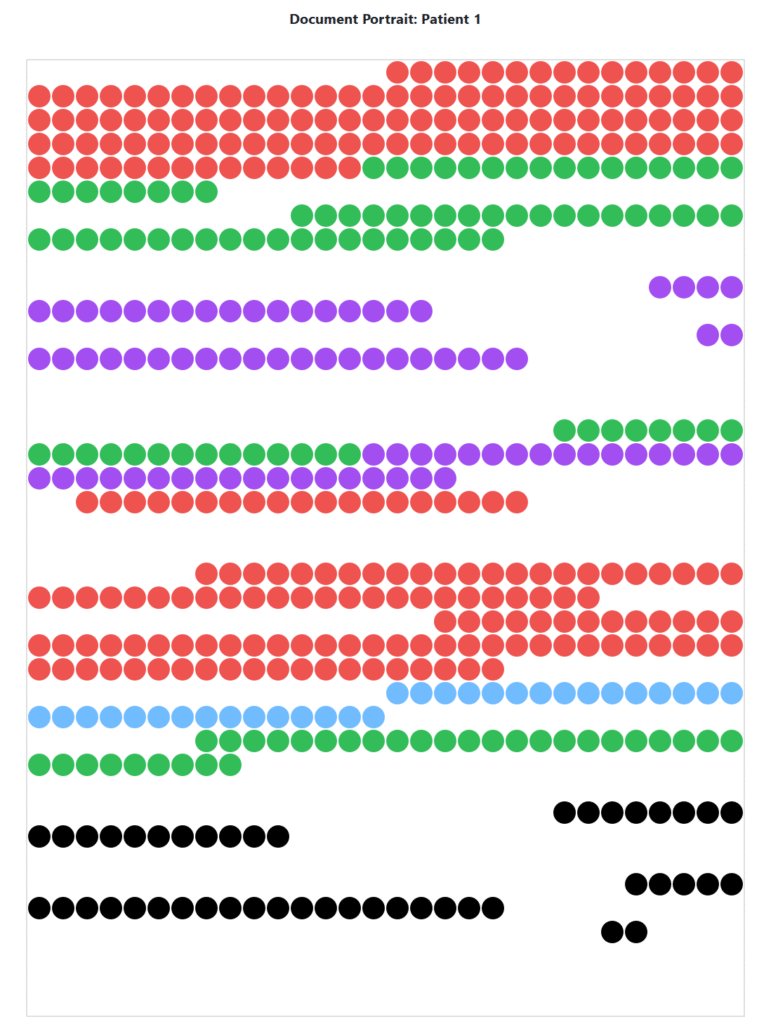
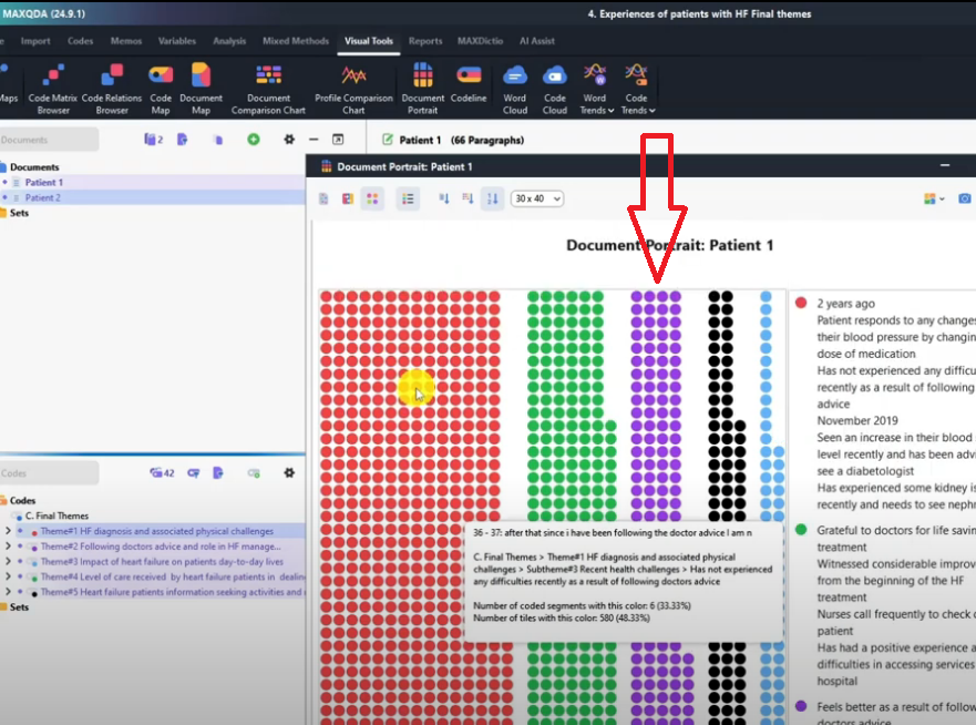
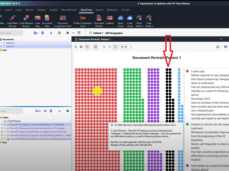
The Document Portrait is a MAXQDA visualization that shows where each theme appears within a single transcript — giving you a spatial picture of how your coding is distributed across the interview.
Go to Visual Tools → Document Portrait → select Only for activated codes → click Yes. Each colored band represents a theme, positioned according to where it appears in the transcript. In my study, the red band (Theme 1) appears at the top of Patient 1’s transcript — meaning those themes were discussed early in the interview. The green band appears in the middle section, and so on.
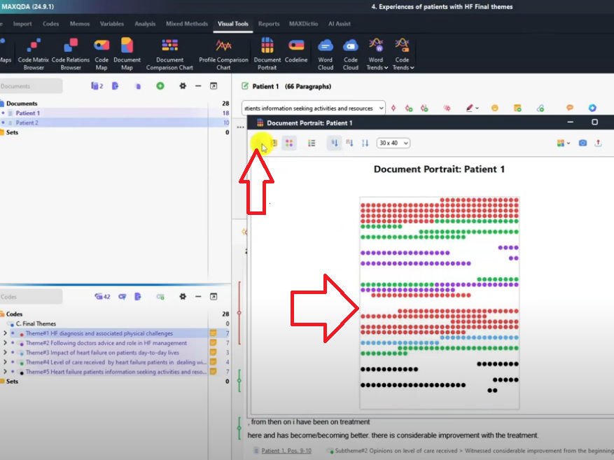
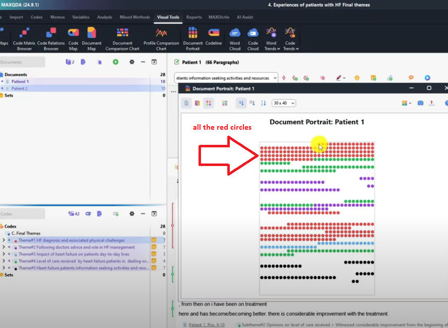
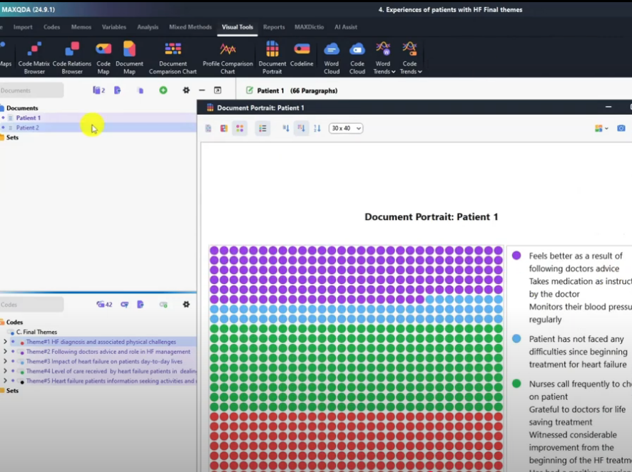
The Document Portrait has four display modes: default (entire document with theme locations), display legend (shows original codes alongside the visual), ordered by colors, and ordered by color frequency. The default view is the most useful for presentations. Export as PNG and include it in your findings chapter to give readers a visual map of how each participant’s interview was coded.
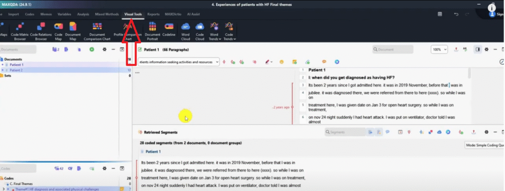

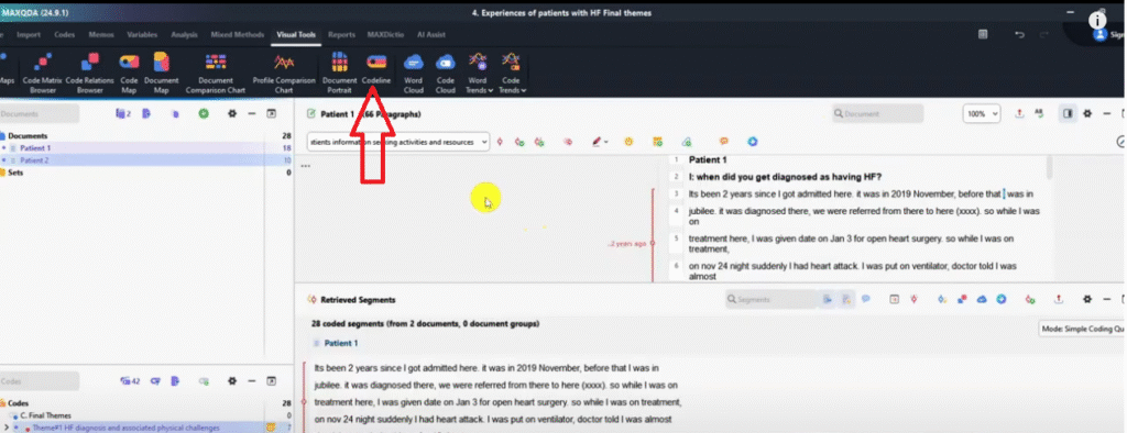
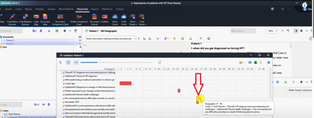
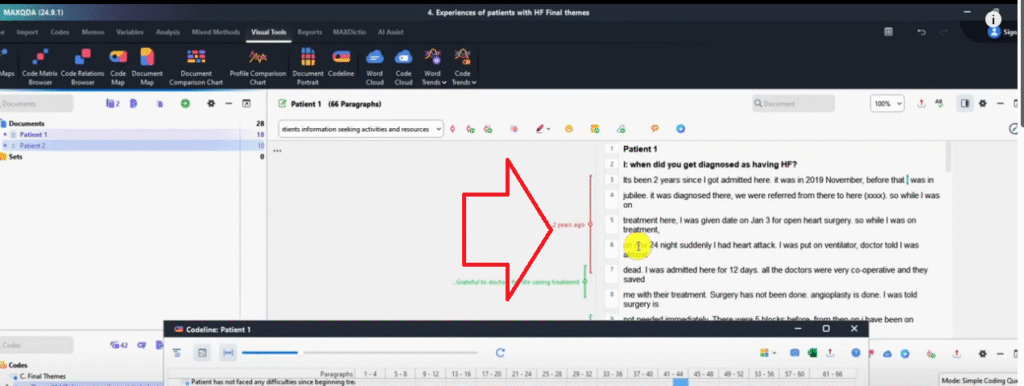
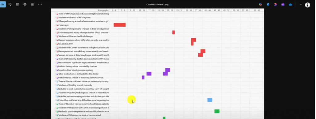
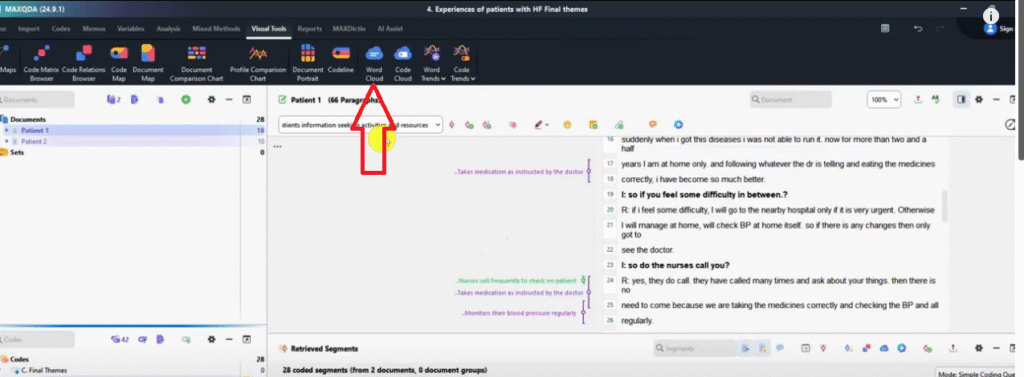
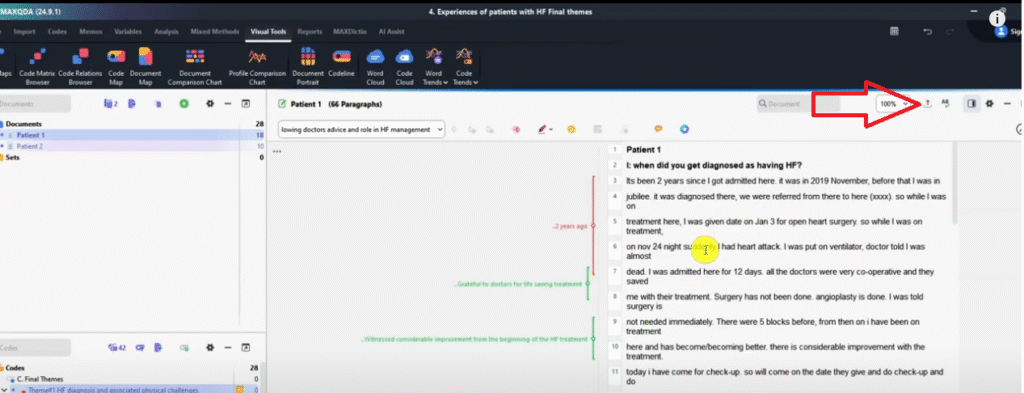
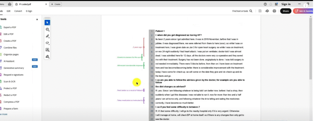
Visualization 3 – Code Line
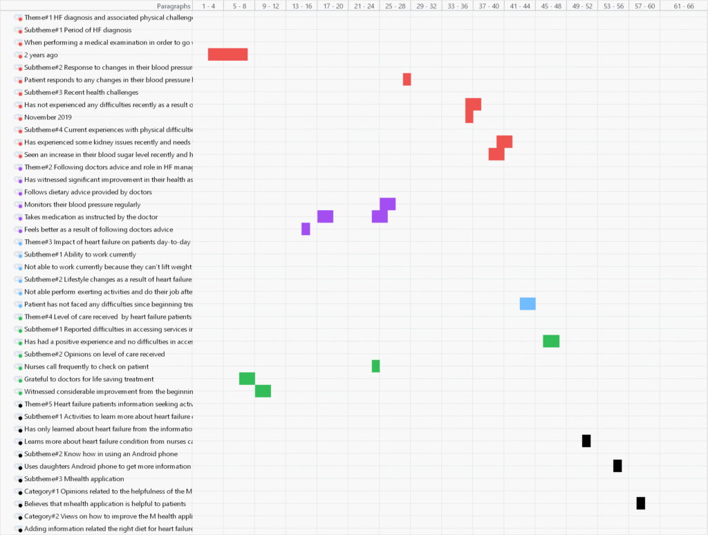
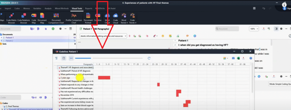
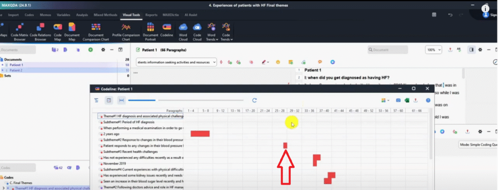
The Code Line is a MAXQDA visualization that shows the exact sentence locations of every coded segment across your transcripts — useful for demonstrating coding precision and locating where specific codes appeared.
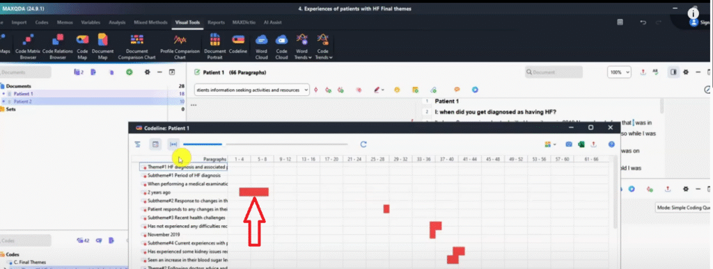
Go to Visual Tools → Code Line. With both transcripts activated, MAXQDA generates a horizontal timeline for each document showing every code as a marker at the sentence where it appears. For example, in my study the code ‘Two years ago’ appeared between sentences 4 and 8 in Patient 1’s transcript — visible as a marker at that position on the code line.
Export as PNG and use this in your appendix to demonstrate systematic coding coverage across your dataset.
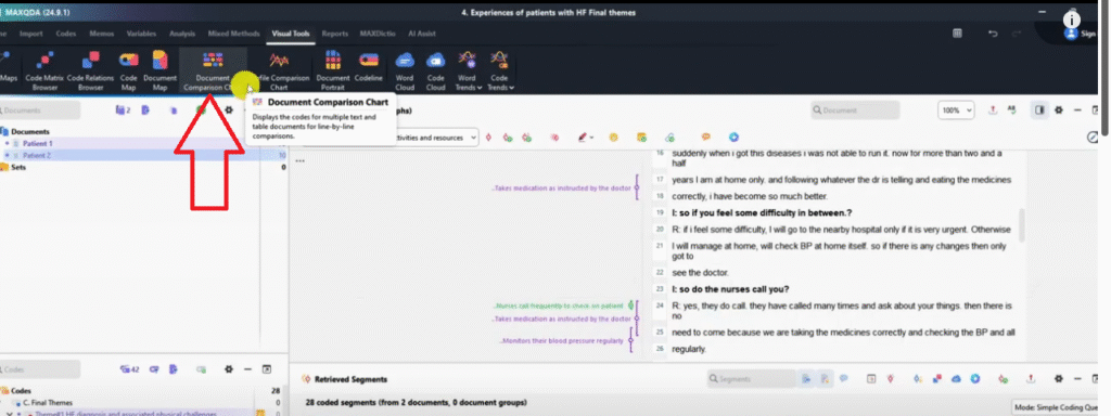
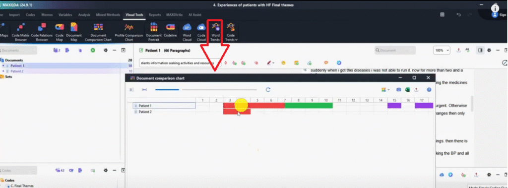
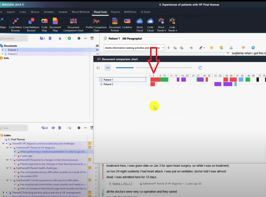
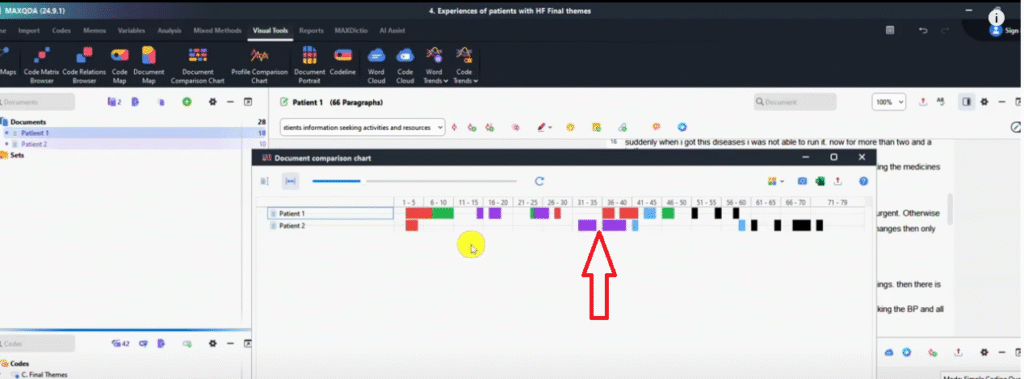
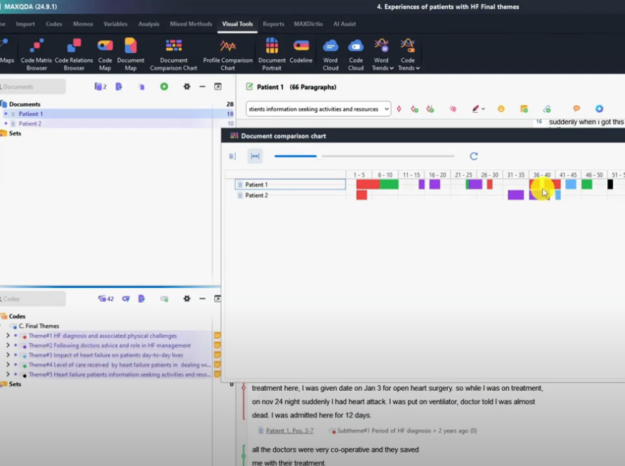
Visualization 4 – Document Comparison Chart

The Document Comparison Chart is a MAXQDA visualization that compares how themes are distributed across multiple participants — making it straightforward to identify where participants agree, differ, or discuss the same themes at different points in their interviews.
Go to Visual Tools → Document Comparison Chart → Only for activated codes → OK. With both transcripts activated, MAXQDA shows each participant’s coded segments side by side. Themes that appear in the same position across both transcripts are co-occurring — participants discussed that topic in the same part of their interview. Themes that appear at different positions highlight divergences in when or how topics were raised.
In my study, Theme 1 co-occurred across both patients, but the purple theme (following doctor’s advice) appeared at very different points — Patient 1 raised it early; Patient 2 raised it much later. This kind of comparison adds depth to your findings chapter. Export as PNG.
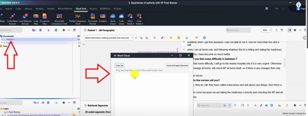
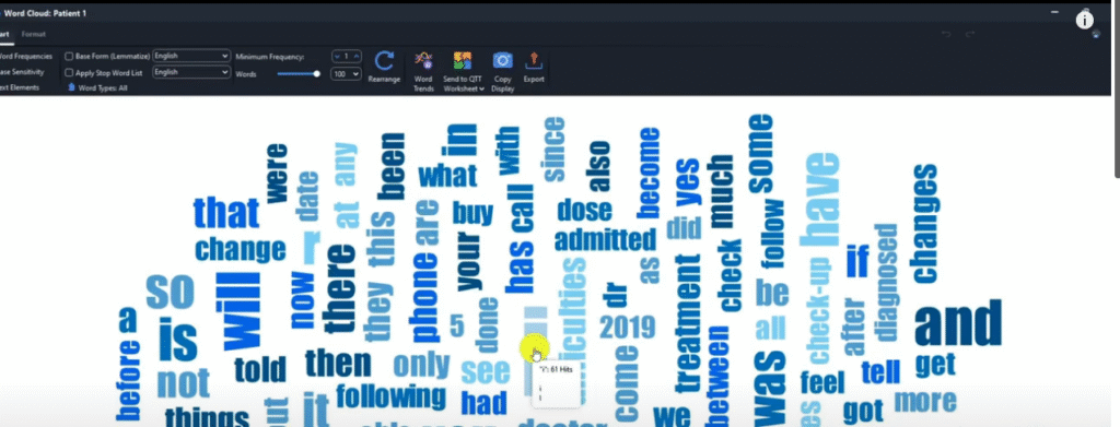
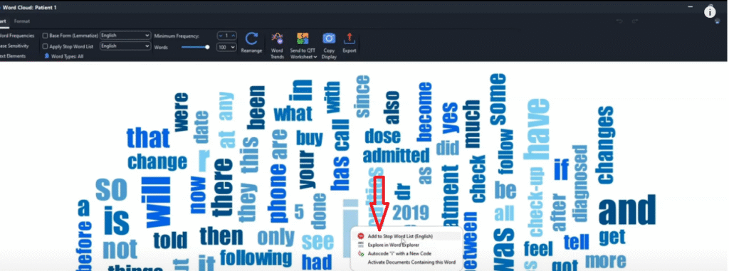
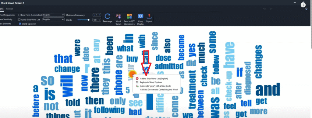
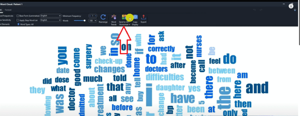
Visualization 5 – Word Cloud
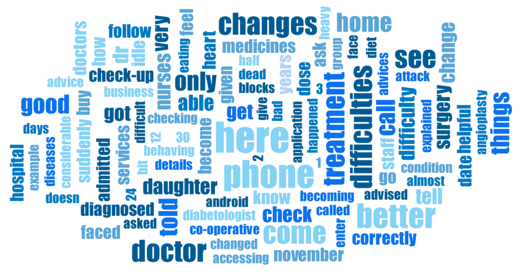
The Word Cloud is a MAXQDA visualization that shows the most frequently used words in a transcript, with more prominent words appearing larger. It gives a quick, accessible overview of what dominated a participant’s language.
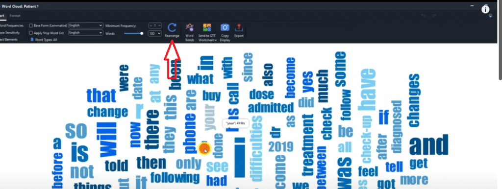
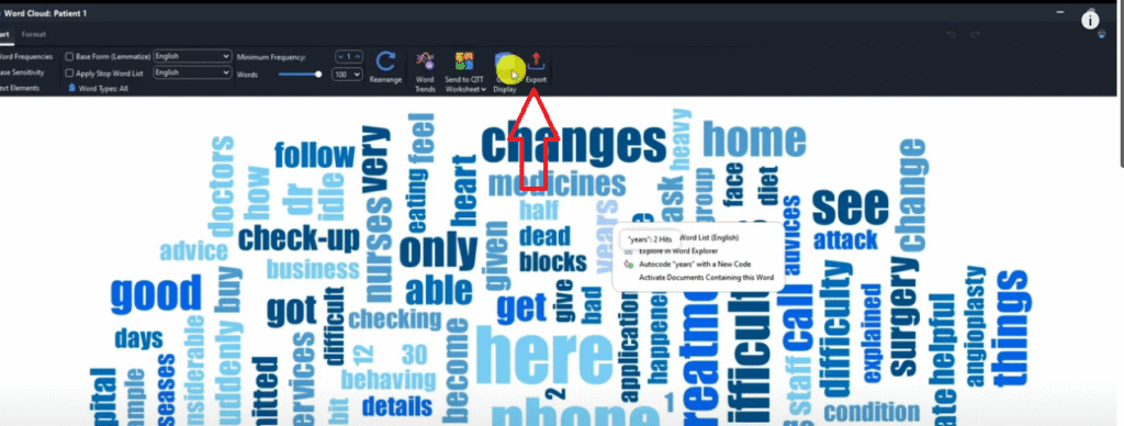
Go to Visual Tools → Word Cloud → drag your transcript(s) into the word cloud builder → click OK. Once generated, you can refine it by adding common words to the stop words list (click any word → Add to stop words list). Words like ‘I’, ‘the’, ‘your’ rarely add analytical value. Once you’ve removed the noise, click Rearrange to refresh the layout, then export as PNG.
Word clouds work best as a supplementary visual rather than a primary finding — they are engaging for presentations and appendices but should always be accompanied by your own analytical commentary.
Visualization 6 – Code Cloud
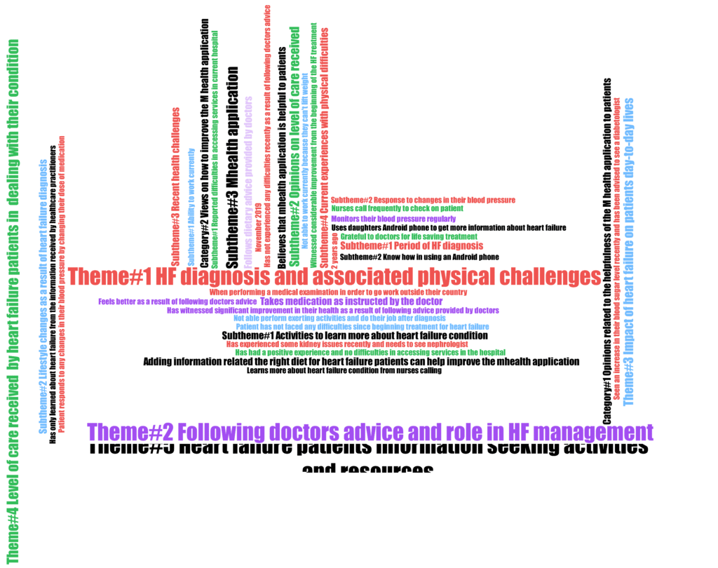
The Code Cloud is a MAXQDA visualization similar to the word cloud, but instead of displaying raw words it displays your actual codes and themes — sized by how frequently each was applied across your dataset.
Go to Visual Tools → Code Cloud → select your transcripts → click OK. The result shows every theme and sub-theme in your code system, with the most frequently coded themes appearing largest. This is a useful quick reference for checking which themes dominated your analysis, and works well as a summary visual in presentations. Export as PNG.
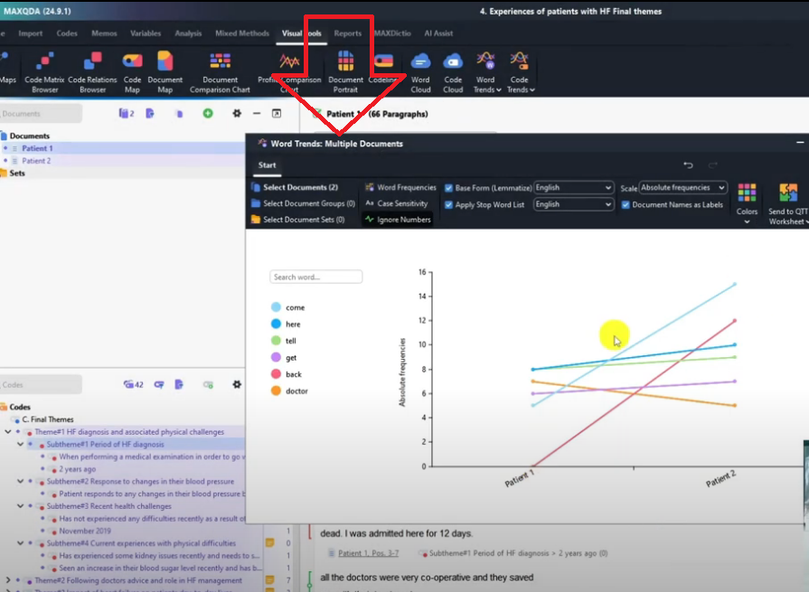
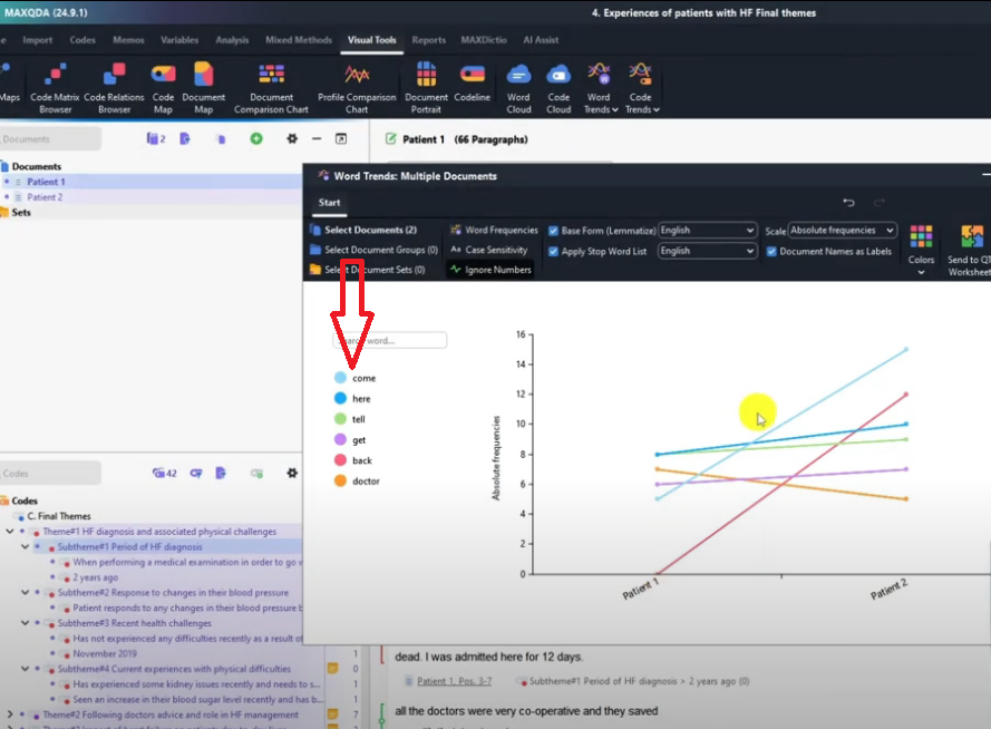
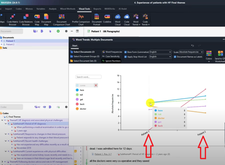
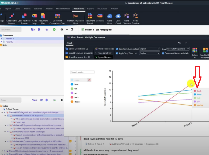
Visualization 7 – Word Trends
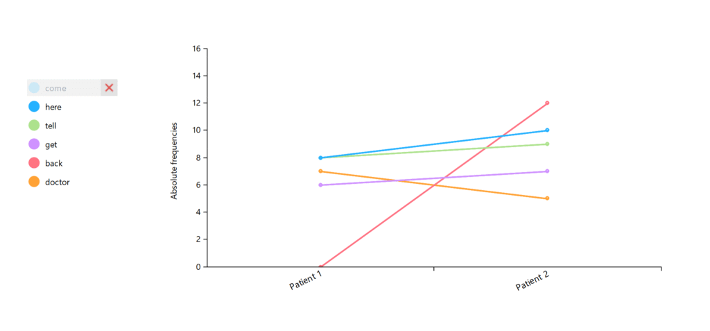
Word Trends is a MAXQDA visualization that lets you track how often specific words appear across different documents — making it easy to compare language patterns between participants.
Go to Visual Tools → Word Trends → select Multiple Documents → choose your transcripts → click OK. MAXQDA generates a chart where you can click on any word to see how frequently each participant used it. In my study, Patient 2 used the word ‘back’ 12 times while Patient 1 used it zero times — a meaningful linguistic difference worth noting in your analysis. Export as PNG.
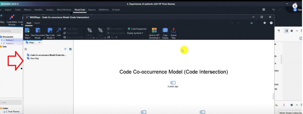
Visualization 8 – MAXMaps
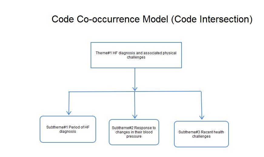
MAXMaps is MAXQDA’s built-in concept mapping tool — it lets you create diagrams, flowcharts, and visual models directly within MAXQDA to illustrate relationships between themes, sub-themes, and concepts.
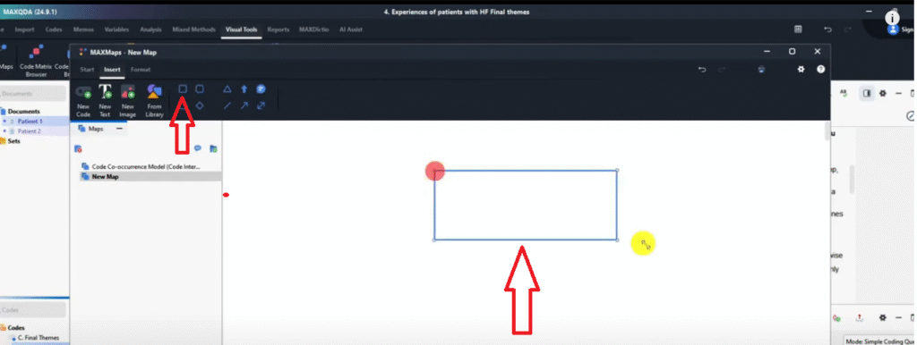
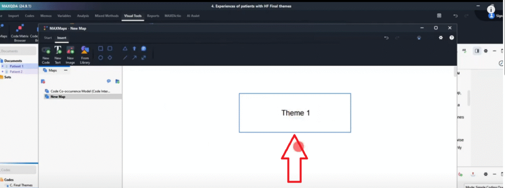
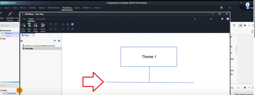
Go to Visual Tools → MAXMaps. The canvas opens with drawing tools: rectangles, rounded rectangles, circles, lines, and arrows. To build a simple theme map: use the rectangle tool to draw a box for your main theme, add a text label (e.g. ‘Theme 1 – HF Diagnosis’), then draw arrow lines connecting it to sub-theme boxes below. This produces a clean hierarchical diagram that can go directly into your findings chapter.
MAXMaps is particularly useful for showing how themes relate to each other — something a code matrix browser or document portrait cannot do. For guidance on how to write up your themes after visualizing them, see my guide on reporting thematic analysis findings in MAXQDA.
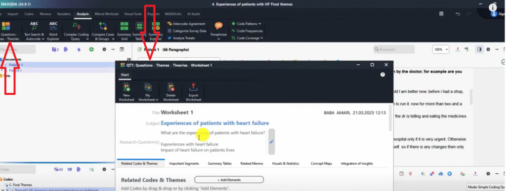
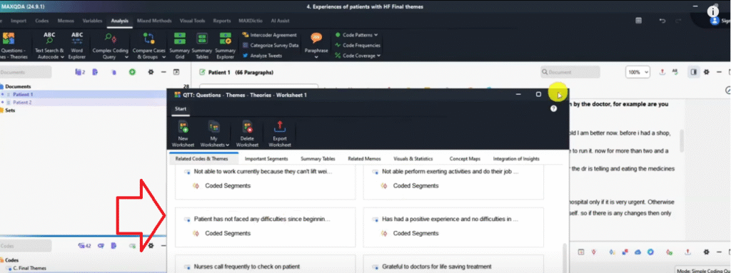
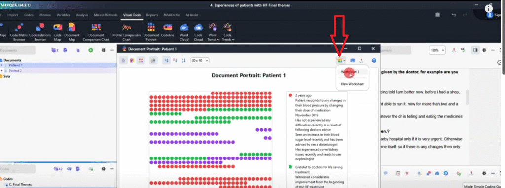
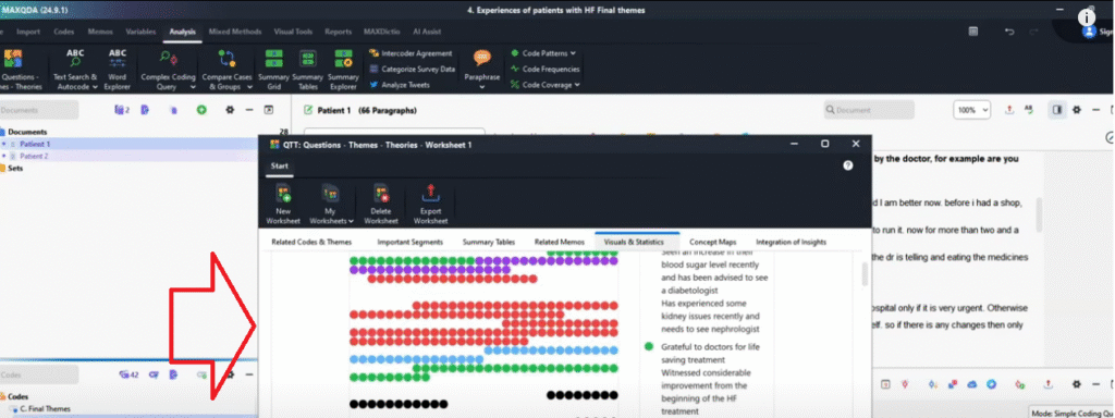
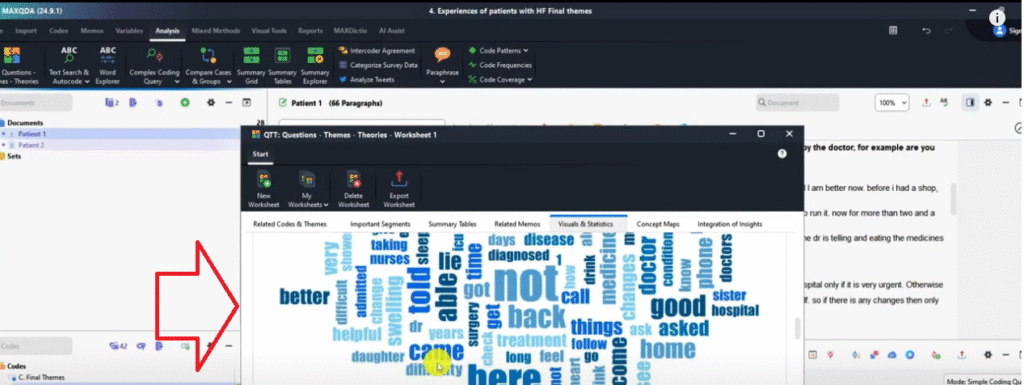
Bonus 1 – The QTT Worksheet
The QTT (Question, Themes, and Theories) Worksheet is a MAXQDA document that collects all your analysis outputs — visualizations, coded excerpts, themes, and notes — into a single exportable report. Think of it as your analysis portfolio.
Go to Analysis → Question Themes and Theories to open the worksheet. You can add information manually, or send visualizations directly from any Visual Tools panel using the Send to QTT Worksheet icon. For example: generate a document portrait → click Send to QTT → generate a word cloud → click Send to QTT. When you export the QTT worksheet, everything you’ve sent appears in one structured Word document with a table of contents.
This is an excellent starting point for your findings chapter — particularly for organizing your visualizations before writing your analytical narrative around them.
Bonus 2 – Exporting Your Coded Document

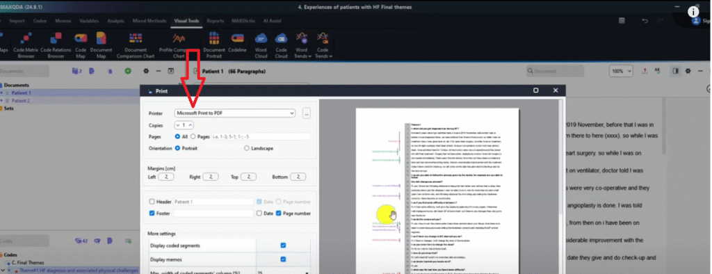
You can export a coded interview transcript directly from MAXQDA — showing the full text with color-highlighted coded segments and theme annotations — to include as an appendix in your dissertation. This demonstrates your coding process transparently to examiners. For more on why transparency matters in your coding process, see my guide on common qualitative coding mistakes.
To export: open the coded document in MAXQDA → click Export → Print → select Microsoft Print to PDF → save. The resulting PDF shows every coded passage highlighted in its theme color, with codes labeled alongside. Attach this to your dissertation appendix as evidence of your systematic coding process.
Frequently Asked Questions
What is the best MAXQDA visualization for a findings chapter? The Code Matrix Browser (exported as a heatmap or percentage view) is the most widely used — it shows theme prominence across participants in a single, interpretable image. Pair it with the Document Portrait for individual participant-level detail.
Can I use MAXQDA visualizations in my dissertation? Yes. All MAXQDA visualizations can be exported as PNG images and embedded directly into Word or PowerPoint. They are appropriate for findings chapters, research presentations, and appendices. Always add a caption explaining what the visualization shows.
Do I need to activate my documents before visualizing? Yes — this is a critical step. Hold Ctrl and click each transcript and each theme/code to activate them before opening any visualization tool. If nothing is activated, MAXQDA either shows an empty visualization or only visualizes a subset of your data.
What is the QTT worksheet used for? The QTT (Question, Themes, and Theories) worksheet is used to consolidate your analysis into a single exportable document. It is particularly useful for organizing visualizations, notes, and coded excerpts before writing your findings chapter.
Which export format should I use for MAXQDA visualizations? Always use PNG for visual output intended for presentations, reports, or dissertations. Export as Excel only if you need raw numbers for your own analysis or table-building.
Key Takeaways
- Color code your themes before generating any MAXQDA visualization — without distinct colors, most visuals are unreadable
- Activate all transcripts and codes with Ctrl+click before opening any visualization tool
- Code Matrix Browser: shows theme prominence across participants — export as heatmap or percentage PNG
- Document Portrait: shows where themes appear within a single transcript — best for participant-level analysis
- Document Comparison Chart: shows theme co-occurrence and divergence across participants
- Word Cloud and Code Cloud: useful supplementary visuals for presentations and appendices
- MAXMaps: use for theme relationship diagrams that show how findings connect
- QTT Worksheet: use to consolidate all visualizations into a single exportable analysis report
- Always export visualizations as PNG — not Excel — for use in documents and presentations
Need Help with Your MAXQDA Analysis?
If you’re working through your MAXQDA analysis and need expert support at any stage — from coding to visualization to the final findings report — I offer a done-for-you qualitative analysis service and one-to-one consulting sessions. Reach out at bernardmugo@survivingresearch.com — I’m happy to help.
![How to Code Qualitative Data in MAXQDA [Step-by-Step Guide]](https://survivingresearch.com/wp-content/uploads/2024/08/Maxqda-Tutorial.webp)
![Is AI Ethical for Qualitative Data Analysis? [Tested]](https://survivingresearch.com/wp-content/uploads/2025/04/Can-I-use-AI-to-do-qualitative-coding-ethically.jpg)