Last Updated on 1 month ago by Grace Nyambura
| Quick summary: After completing thematic analysis in ATLAS.ti, you need to present your findings visually. This guide covers five visualization tools — word clouds, code document analysis, concept charts, hierarchy charts, and tables — that will make your qualitative findings report clearer and more compelling. |
- Why Visual Outputs Matter in a Qualitative Findings Report
- 1. Word Cloud in ATLAS.ti
- 2. Code Document Analysis in ATLAS.ti
- 3. Concepts Chart in ATLAS.ti
- 4. Hierarchy Chart for Themes and Codes
- 5. Thematic Analysis Table
- Which ATLAS.ti Visualization Should You Us
- Frequently Asked Questions
- Key Takeaways
- Need Help With Your ATLAS.ti Analysis?
In this article, I’m going to show you five ways to visualize your data in ATLAS.ti so you can produce a findings report that any committee or supervisor would be impressed by.
My name is Bernard Mugo — I’ve spent the past three years helping more than 250 PhD students complete their thematic analysis, write up their findings, and finally get through Chapter Four of their dissertation. Through that experience, I’ve developed a clear picture of what works when it comes to presenting qualitative research findings in a way that’s both academically rigorous and easy to read.
After conducting thematic analysis — whether you’re using ATLAS.ti or any other qualitative software — you will always need to express your data in a narrative format. But a narrative alone can feel dense. Visuals break it up, reinforce your argument, and show your reader exactly how your codes and themes connect.
Here are the five visuals you can create:
- Word Cloud
- Code Document Analysis
- Concepts Chart
- Hierarchy Chart
- Thematic Analysis Table
Let’s go through each one step by step.
Why Visual Outputs Matter in a Qualitative Findings Report
When you’ve finished coding your interviews in ATLAS.ti, the next challenge is communication. Your supervisor, committee, or reader wasn’t there when you read through those transcripts — they’re relying on you to translate patterns in the data into something they can see and trust.
A well-constructed findings report combines narrative with visuals. According to ATLAS.ti’s research hub, visual analysis tools help researchers move beyond raw data to communicate findings more clearly and persuasively. Each of the five visuals below serves a different purpose in that process.
1. Word Cloud in ATLAS.ti
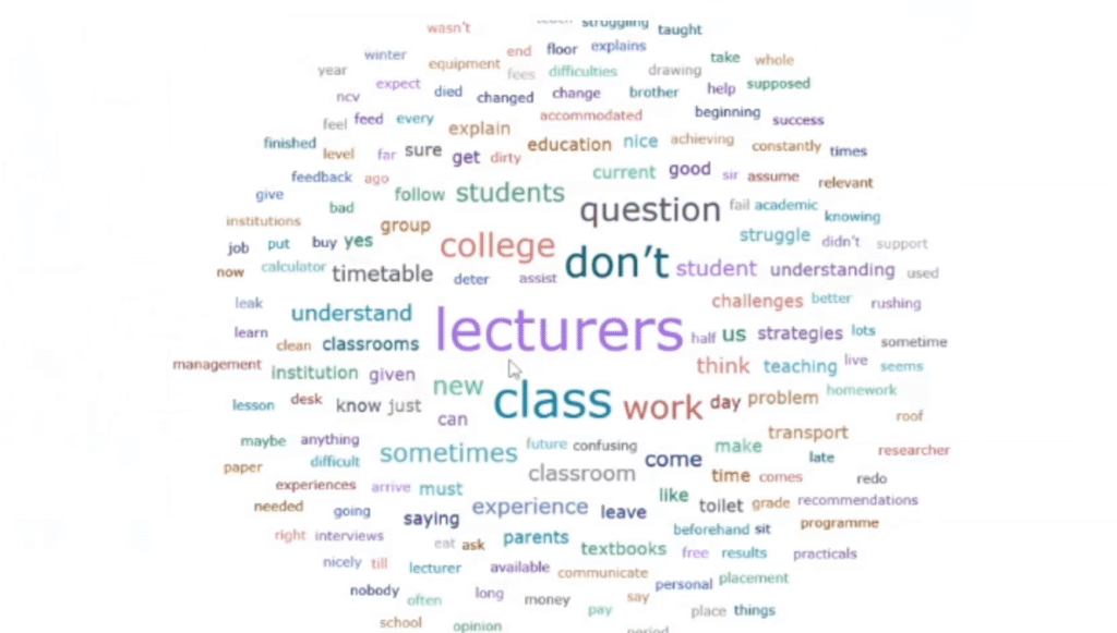
A word cloud is the fastest visual you can generate in ATLAS.ti, and it immediately shows your reader which words — and therefore which concepts — dominated your data. You can create a word cloud for individual transcripts or across all your documents.
How to Create a Word Cloud in ATLAS.ti
Follow these steps:
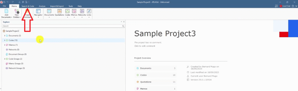
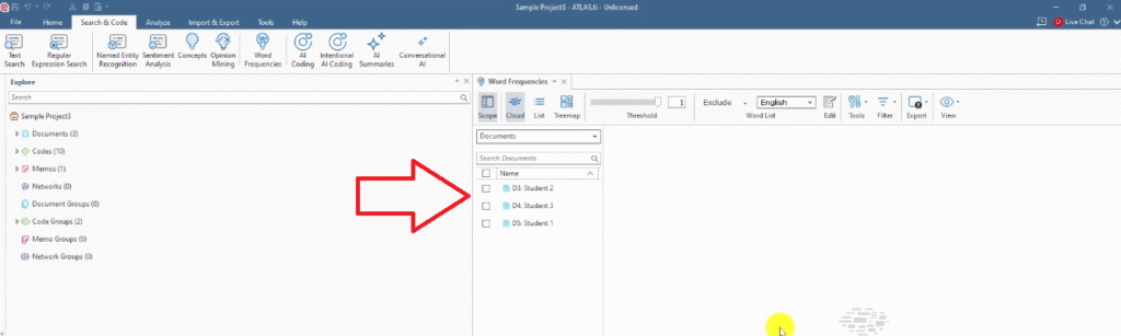
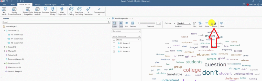
- Go to the Search and Code section in the top menu.
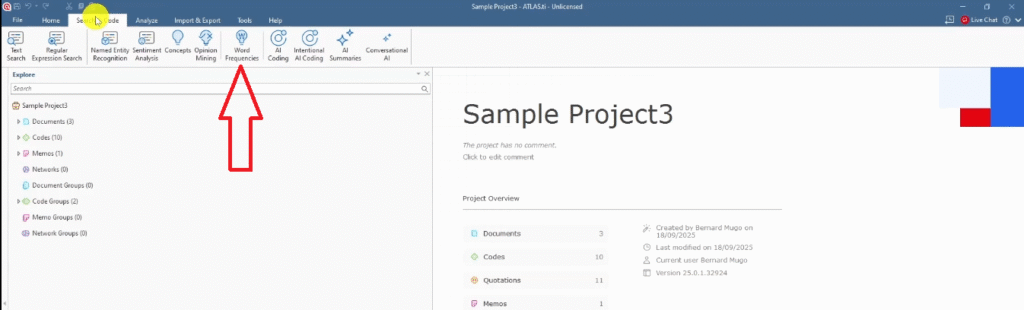
- Click on Word Frequencies.
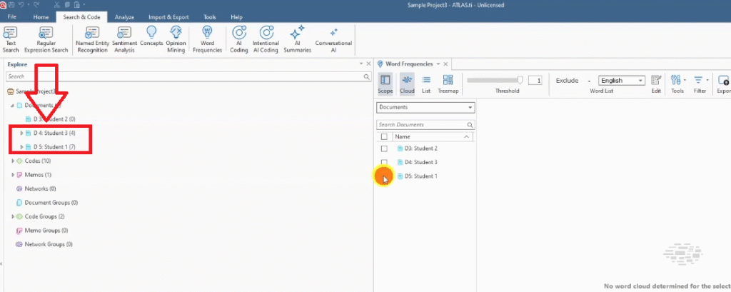
- ATLAS.ti will display your original transcripts — select the document(s) you want to visualize.
- Click Generate and ATLAS.ti will produce the word cloud automatically.
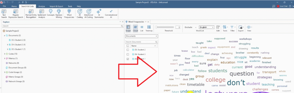
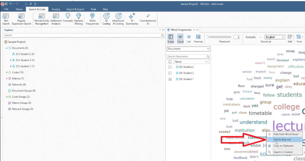
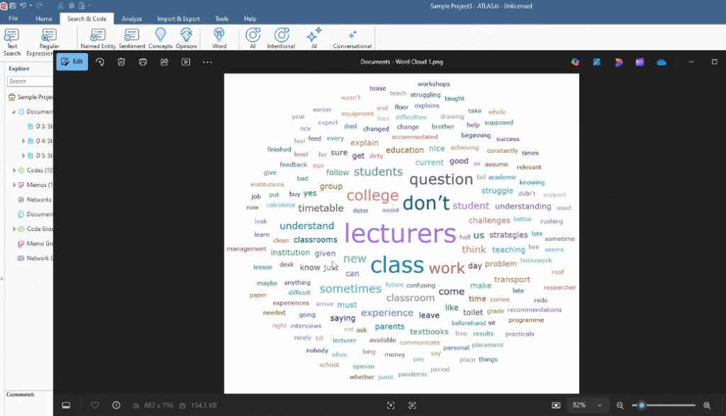
Once the cloud is generated, you’ll often want to clean it up. Right-click on any word you’d like to remove and select Add to Stop Words List — that word disappears from the cloud immediately. This is how you filter out unhelpful filler words and focus the cloud on meaningful concepts.
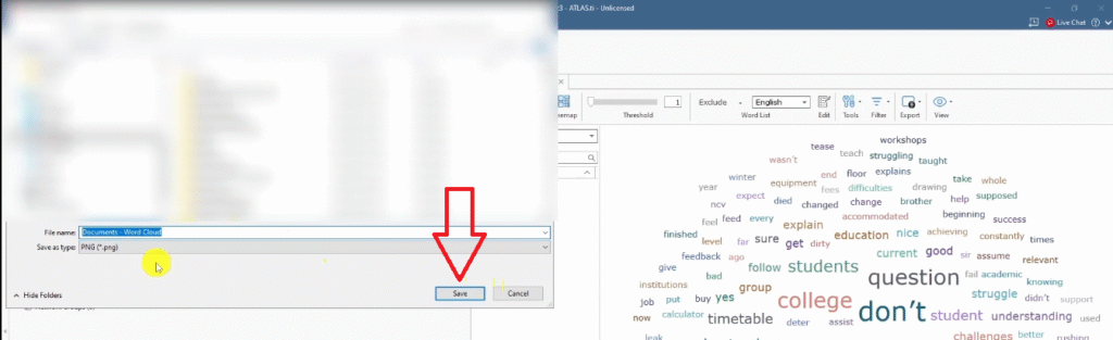
How to Export Your Word Cloud
Once you’re happy with the result, go to the menu and click Export. Save it as an image file. That exported image is ready to paste directly into your Word document as a figure in your findings chapter.
A word cloud works especially well as a visual complement to your introductory findings paragraph — it shows the reader at a glance what the data was broadly about before you go deeper into your themes.
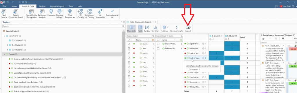
2. Code Document Analysis in ATLAS.ti
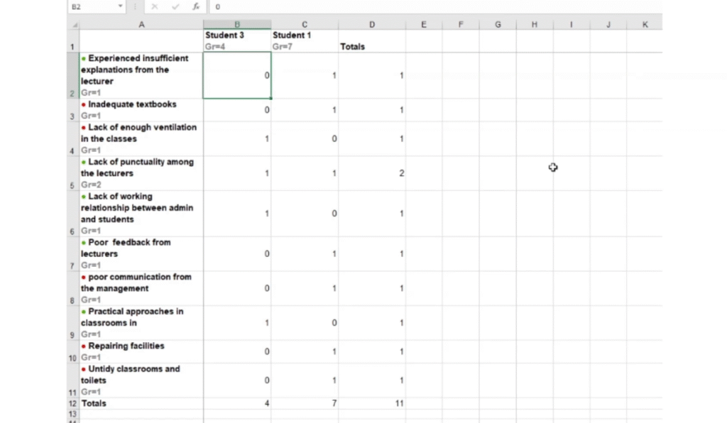
The code document analysis is one of my favourite visuals for a findings chapter because it gives you hard numbers. It shows exactly how many times each code appeared in each participant’s transcript — which is powerful evidence that your coding was thorough and systematic.
How to Run a Code Document Analysis
Here’s how to generate it:
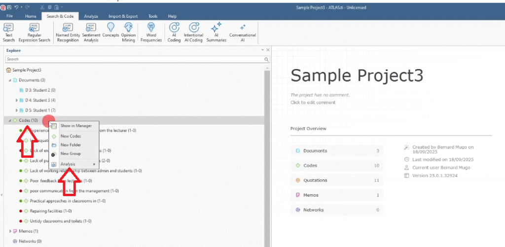
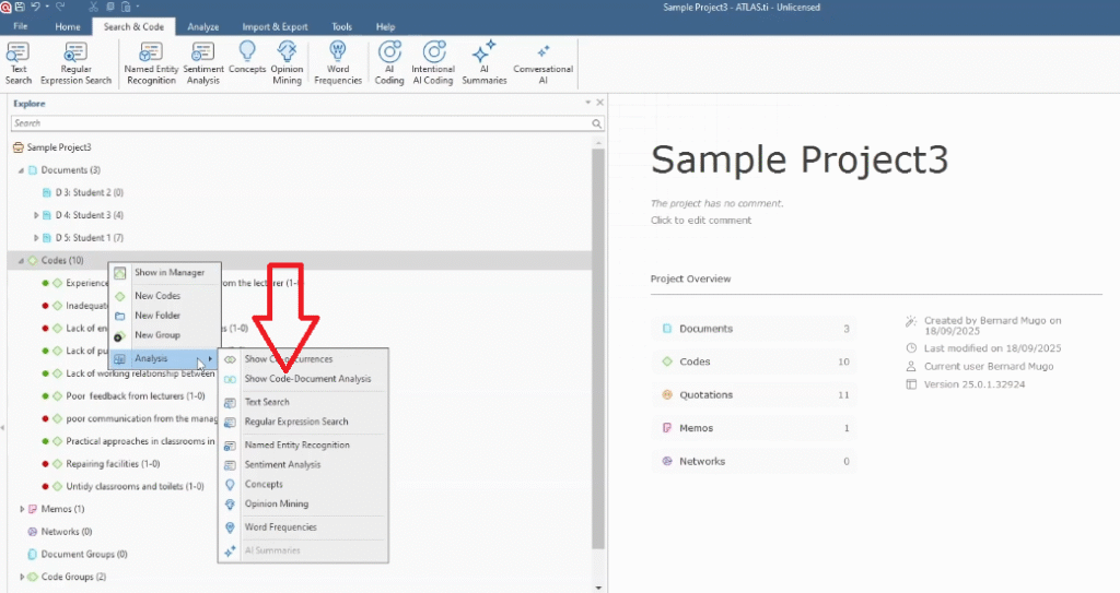
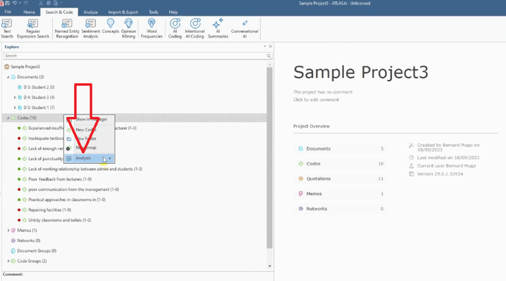
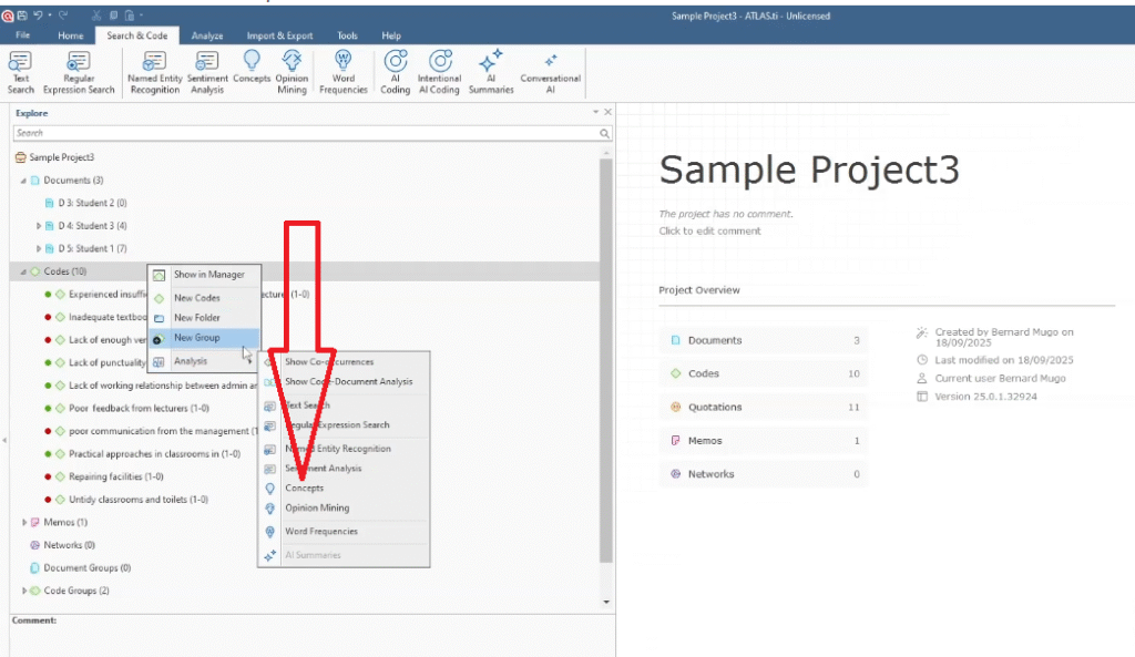
- In ATLAS.ti, go to the Codes panel.
- Right-click on any code and select Analysis.
- Choose Show Code Document Analysis.
- ATLAS.ti generates a matrix showing codes against documents, with frequency counts.
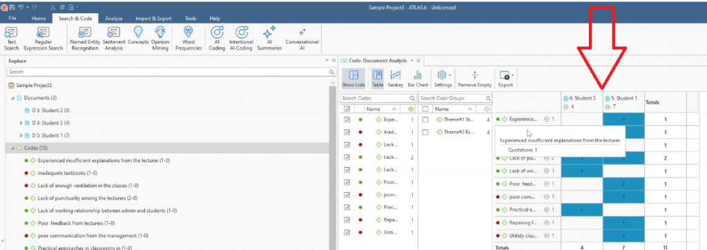
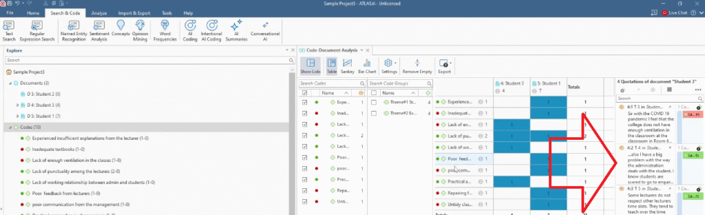
The matrix tells you which codes came from which participant and how many quotations each code produced. When you click on a specific cell in the matrix, ATLAS.ti displays the actual quotes associated with that code — useful for verifying your coding before you export.
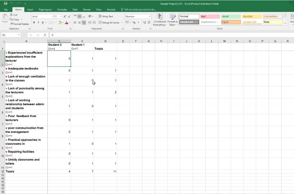
Exporting Code Document Analysis to Excel
Click Export in the toolbar and select Excel. The exported file gives you a clean spreadsheet of codes, documents, and frequency counts. This table can be inserted directly into your findings report as an appendix or embedded as supporting evidence for your coding framework.
3. Concepts Chart in ATLAS.ti
The concepts chart is similar to a word cloud but operates at a higher level — instead of showing word frequencies, it shows the major conceptual themes that emerged across your documents. It’s a more academically appropriate visual for a dissertation than a standard word cloud.
How to Generate a Concepts Chart
Follow these steps:
- Go to the Codes panel in ATLAS.ti.
- Right-click and select Analysis.
- Choose Concepts.
- Select the documents you want to include in the analysis.
- ATLAS.ti generates the concepts chart showing the dominant themes across your selected data.
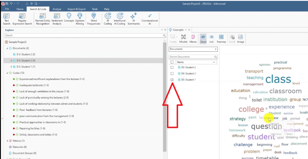
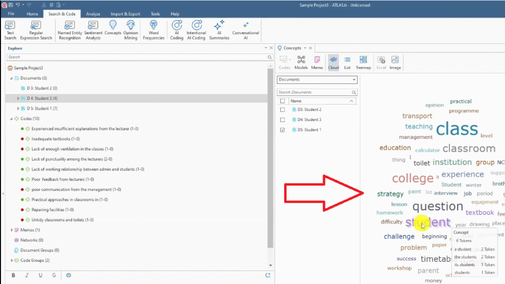
The concepts chart is particularly useful when you’re presenting a multi-document dataset and want to show patterns that appear across participants rather than within a single transcript. Think of it as your bird’s-eye view of the thematic landscape.
4. Hierarchy Chart for Themes and Codes
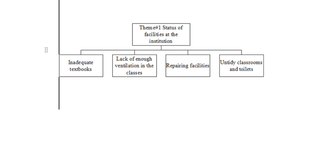
The hierarchy chart is the visual I recommend most strongly for any thematic analysis findings chapter. It maps your themes and codes in a tree structure — showing your reader exactly how you moved from raw codes to higher-level themes. This is directly aligned with how Braun and Clarke’s thematic analysis framework describes the hierarchical relationship between codes and themes.
Unlike the other visuals in this list, the hierarchy chart isn’t built inside ATLAS.ti — you create it in Microsoft Word using SmartArt, pulling your theme and code names directly from ATLAS.ti.
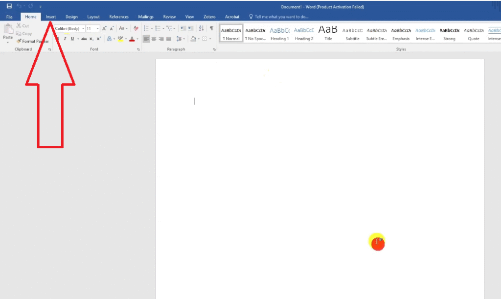
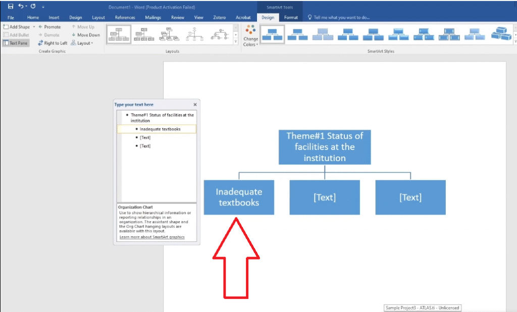
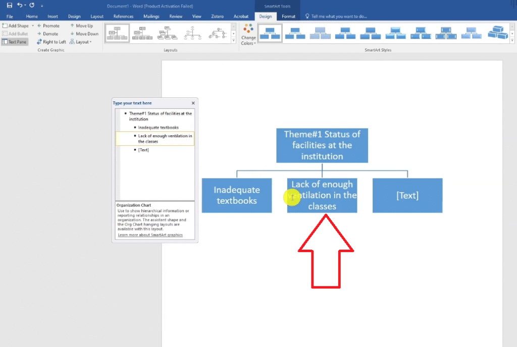
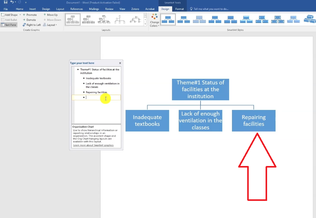
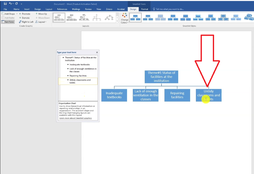
How to Build a Hierarchy Chart in Word Using SmartArt
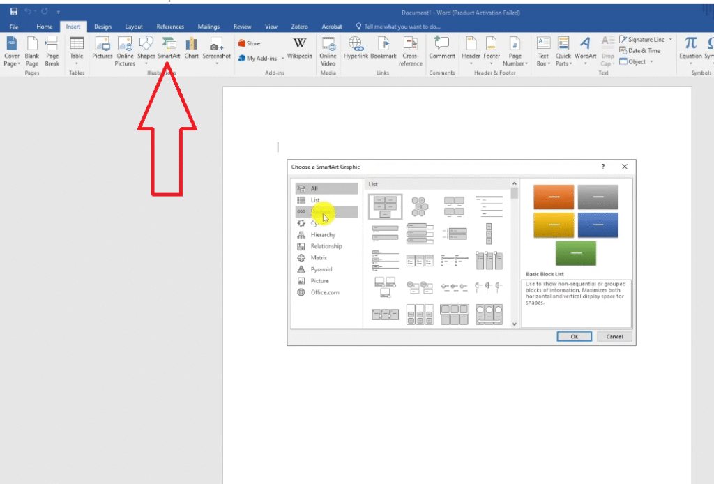
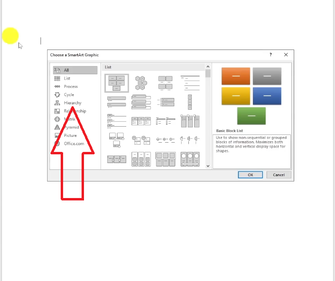
- In Word, go to Insert > SmartArt.
- Select the Hierarchy category and choose your preferred chart style.
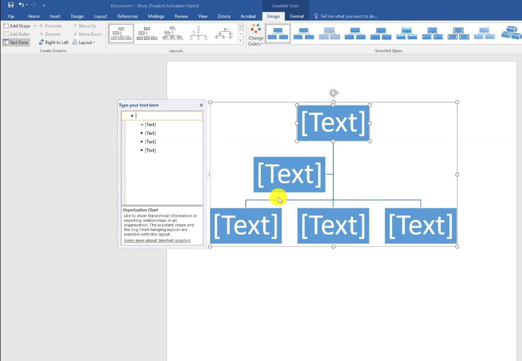
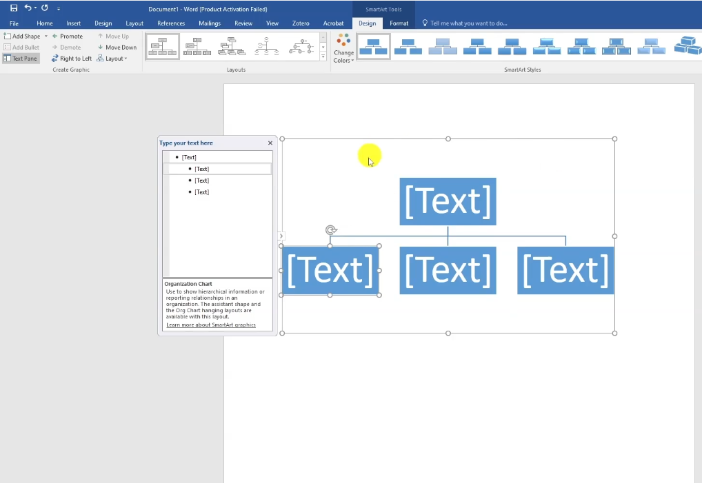
- Delete any boxes you don’t need to simplify the structure.
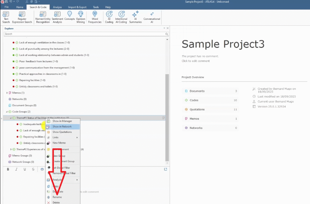
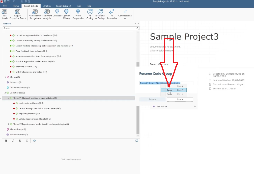
- Go back to ATLAS.ti, right-click on your first theme, and select Rename to see the full theme name. Copy it.
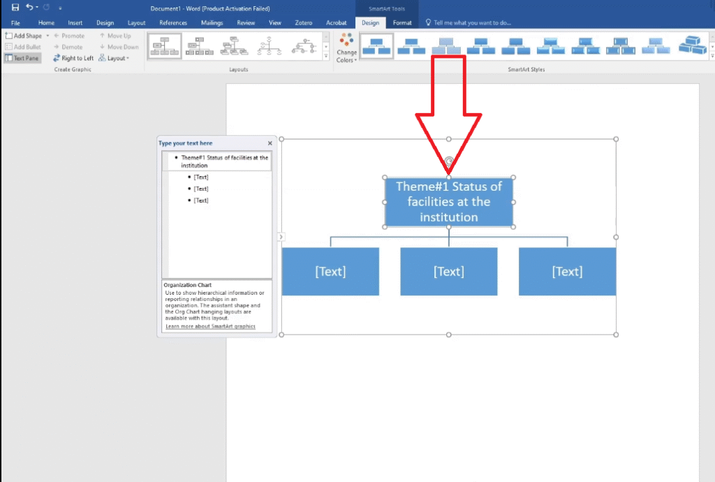
- Paste the theme name into the top-level box in your SmartArt chart.
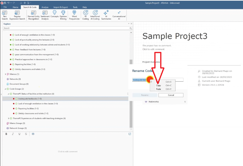
- Copy each code under that theme from ATLAS.ti and paste into the second-level boxes below the theme.
- Press Enter inside a box to add more codes at the same level.
- Repeat for each theme.
- Once complete, go to Design > Change Colors and select black and white for a clean, print-friendly look.
- Select all (Ctrl+A), return to Home, and set the font to Times New Roman, size 12 — standard for most dissertations.
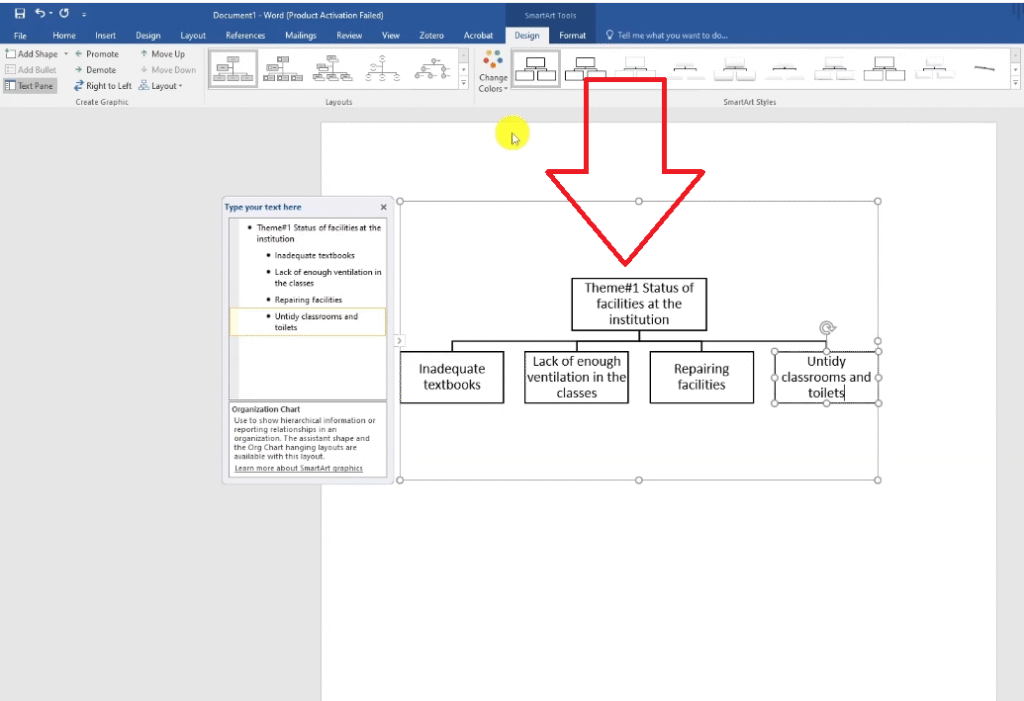
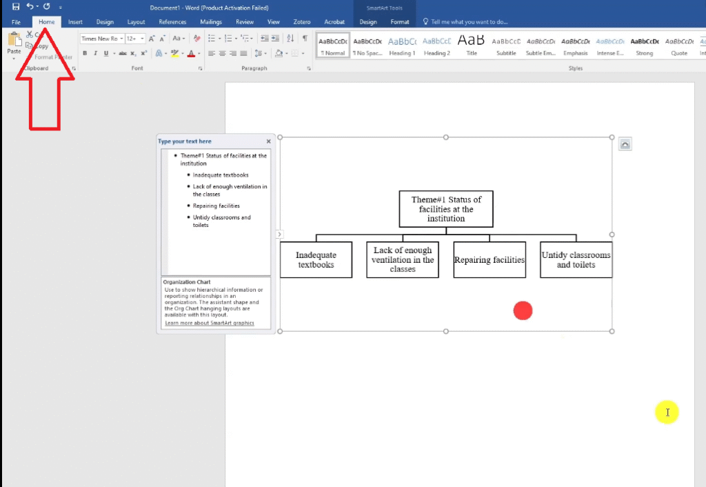
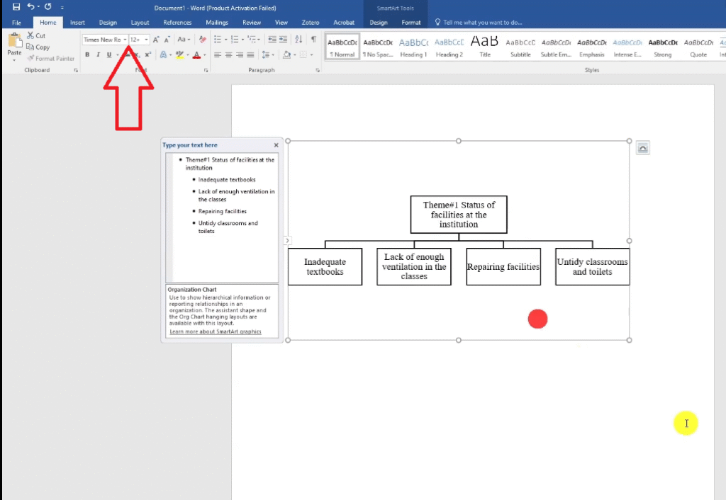
The result is a fully editable visual that shows your themes at the top level and the codes nested beneath them. It’s one of the clearest ways to demonstrate your analytical process to an examiner.
5. Thematic Analysis Table
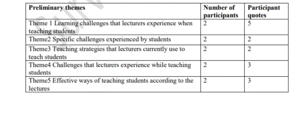
A themes and codes table is the most versatile visual in this list. You can use it to show the themes and their codes, to display how frequently each code appeared, or to include direct participant quotes alongside each theme.
How to Create a Themes and Codes Table
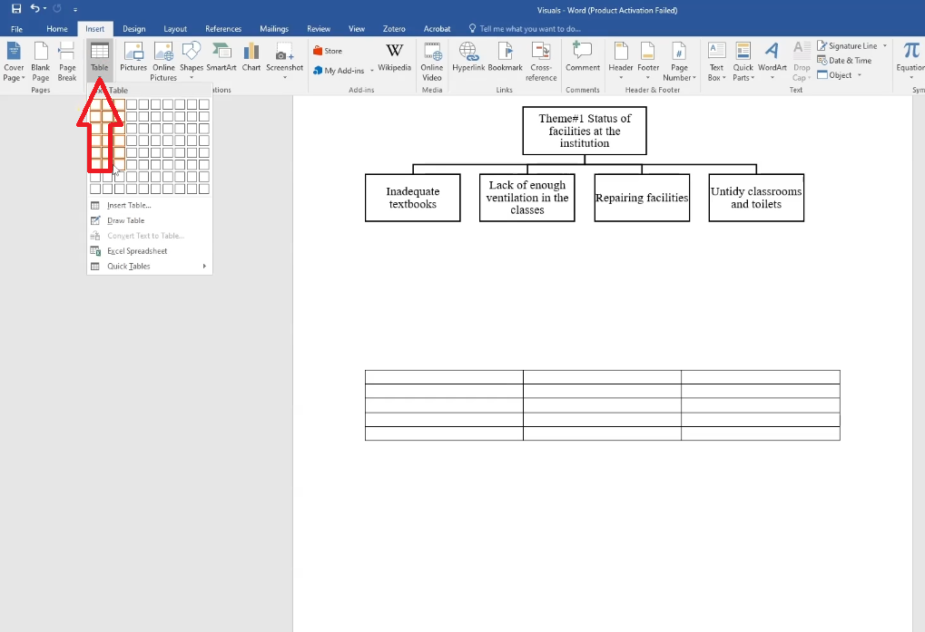
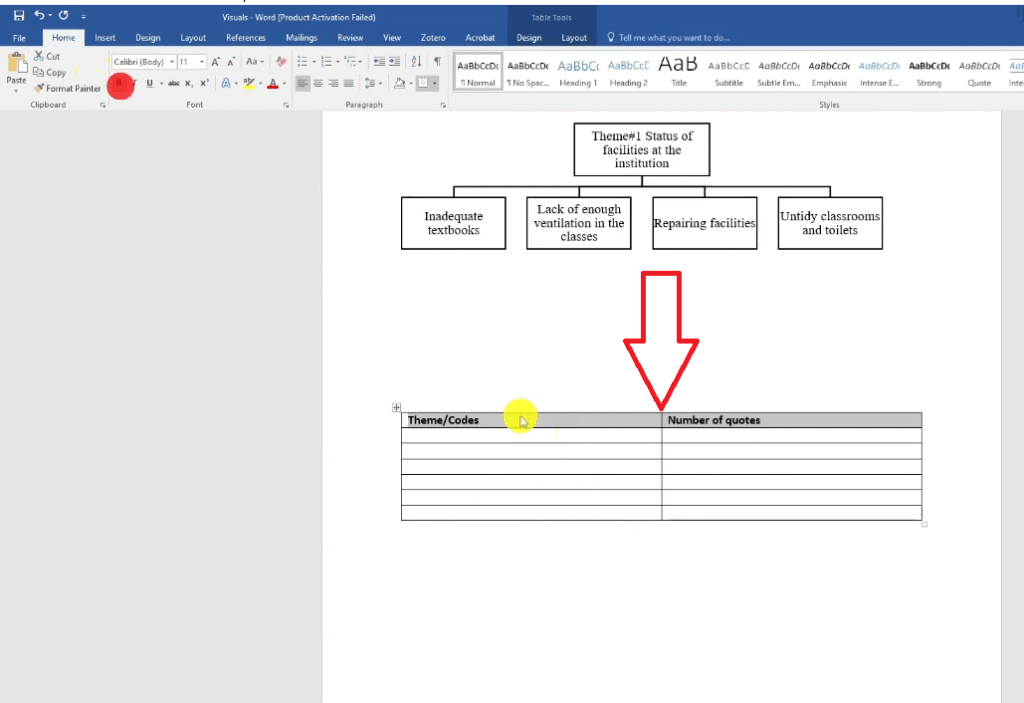
- In Word, go to Insert > Table and create a table with columns for Theme, Code, and Number of Quotes.
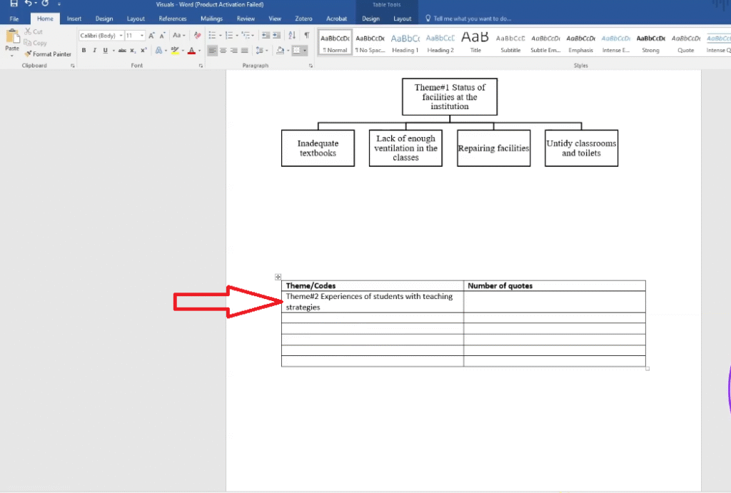
- Go back to ATLAS.ti and copy your first theme name, then paste it into the Theme column.
- Copy each code under that theme and paste into the Code column.
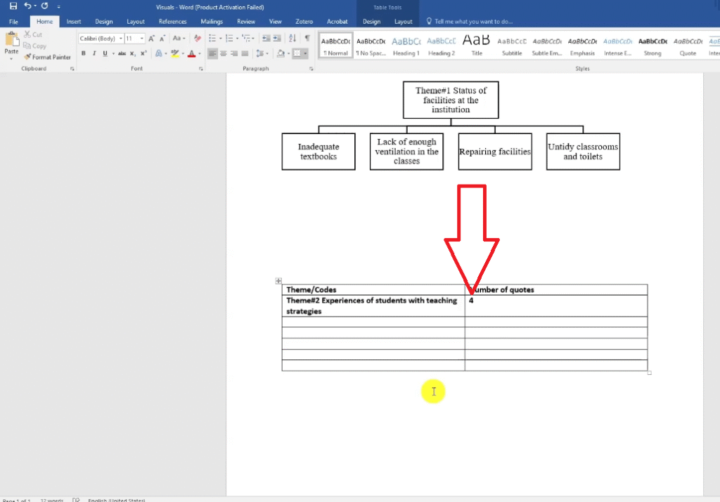
- Enter the frequency count (number of quotes) for each code from your code document analysis.
Repeat for all themes
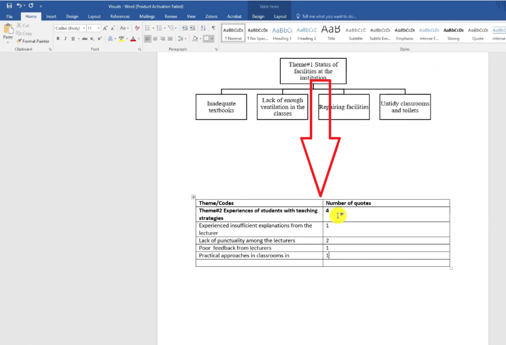
The table is particularly effective when you want to present quantitative frequency data alongside qualitative themes — it shows an examiner that your thematic analysis was systematic, not impressionistic. You can also add a fourth column for representative quotes to bring participant voices directly into your findings chapter.
Which ATLAS.ti Visualization Should You Us
Each visual serves a different purpose in your findings chapter:
| Visual | Best For | Where in Report |
| Word Cloud | Overview of dominant words per document | Introduction of findings section |
| Code Document Analysis | Showing coding frequency across participants | Appendix or methodology section |
| Concepts Chart | Showing conceptual themes across multiple documents | Cross-document pattern section |
| Hierarchy Chart | Showing themes-to-codes structure clearly | Opening of each theme section |
| Table | Summarizing themes, codes, and frequency counts | Summary of findings section |
For a deeper understanding of how these visuals fit into a full thematic analysis write-up, I highly recommend reading Scribbr’s guide to reporting qualitative findings alongside this article.
If you want to learn how to get to this point — completing the thematic analysis itself — check out my step-by-step guide on inductive thematic analysis using ATLAS.ti (Saldana’s method). That post walks through the full coding process from first reading to final theme.
And if you’re still deciding whether qualitative research is the right approach for your study, my article on qualitative vs quantitative data breaks down the key differences in plain language.
You might also find it useful to review the core characteristics of qualitative research before diving into your visualization work — understanding what makes qualitative data different shapes how you present it.
Frequently Asked Questions
Can I export ATLAS.ti visualizations directly into my dissertation?
Yes. Word clouds and concepts charts can be exported as image files from ATLAS.ti and inserted directly into your Word document as figures. The code document analysis exports to Excel, which you can embed as a table. The hierarchy chart and themed table are built manually in Word, so they’re already in the right format.
Which visualization is most commonly used in PhD dissertations?
The hierarchy chart and the thematic analysis table are the two most commonly expected visuals in a findings chapter. They directly show the structure of your thematic analysis — your themes, your codes, and how they relate — which is exactly what an examiner is looking for.
Do I need all five visuals in my report?
No. Use whichever visuals best communicate your findings. Most dissertations include a hierarchy chart and a table at minimum. The word cloud and concepts chart are optional extras that work well in certain contexts but aren’t always necessary.
Is ATLAS.ti the only software that can create these visualizations?
No. NVivo and MAXQDA both offer similar visualization tools. The specific steps differ, but the underlying visuals are common across all major qualitative data analysis packages. If you’d like to see how qualitative interviews are conducted before you start coding, check out my guide on how to conduct a qualitative research interview.
Key Takeaways
- ATLAS.ti has built-in tools for generating word clouds, code document analysis, and concepts charts directly from your coded data.
- The hierarchy chart is the most academically powerful visualization — build it in Word using SmartArt by copying theme and code names from ATLAS.ti.
- A thematic analysis table (themes, codes, frequency) gives examiners quantitative evidence of your systematic coding process.
- Each visual serves a different purpose — use the right one for the right part of your findings chapter.
- You don’t need all five in every dissertation — the hierarchy chart and table are the minimum recommended for most qualitative studies.
Need Help With Your ATLAS.ti Analysis?
If you’ve completed your coding in ATLAS.ti but you’re not sure how to turn it into a full findings chapter, I can help. I’ve worked with more than 250 PhD students on exactly this — taking a set of coded transcripts and producing a clean, submission-ready findings report.
Get in touch here and tell me where you are in your project. I’ll take it from there.
![Qualitative Analysis of Interviews in ATLAS.ti [Step-by-Step]](https://survivingresearch.com/wp-content/uploads/2025/09/Qualitative-Data-Analysis-Just-Got-Easier-Atlas.ti-Tutorial-2025.jpg)
![Thematic Analysis in ATLAS.ti: Braun and Clarke 6 Steps [Full Guide]](https://survivingresearch.com/wp-content/uploads/2025/10/Thematic-Analysis-with-Atlas-ti.jpg)