
Last Updated on 5 months ago by Grace Nyambura
If you’ve already completed your thematic analysis in NVivo but haven’t used the project map feature, you’re missing something your supervisor is actively looking for. An NVivo project map lets you visually show how your themes connect, how participants contributed to those themes, and how your findings tell a coherent story — all directly from your data.
In this step-by-step guide, I’ll show you exactly how to build and use a project map in NVivo after conducting thematic analysis. By the end, you’ll have a publication-ready visual you can drop straight into your findings chapter.
- What Is an NVivo Project Map?
- Why Your Supervisor Wants to See This
- Step 1 — Convert Your Transcripts to Cases in NVivo
- Step 2 — Create a New Project Map
- Step 3 — Add Participants and Themes to Your Map
- Step 4 — Organize and Format Your Project Map
- Step 5 — Export Your Project Map as an Image
- 3 Project Map Examples for Thematic Analysis
- Final Thoughts
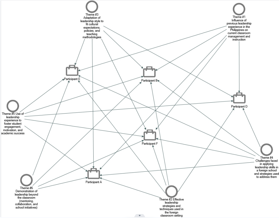
Quick summary: An NVivo project map is a visual diagram that shows relationships between your themes, codes, and research participants — built directly from your coded data inside NVivo.
What Is an NVivo Project Map?
An NVivo project map is a visual tool in NVivo’s Explore menu that maps the relationships between your cases (participants), codes, and themes. Unlike a PowerPoint diagram you create manually, a project map is generated from your actual coded data — which means it accurately reflects your analysis rather than just looking good on a slide.
Most researchers try to show theme relationships in long paragraphs or generic diagrams. A project map is far more powerful because it’s grounded in evidence from your transcripts. If you’re still getting to grips with NVivo, start with the step-by-step NVivo guide for beginners before continuing here.
Why Your Supervisor Wants to See This
When you present thematic analysis findings, it’s not enough to list your themes. What examiners and supervisors are looking for is evidence that you understand how your themes relate to each other and how different participants contributed to each one. A project map provides exactly that — in a format that’s clear, visual, and directly tied to your data.
Step 1 — Convert Your Transcripts to Cases in NVivo
Before you can build a project map, each participant transcript needs to be set up as a case in NVivo.
- Select all your transcripts using Ctrl+A (or Cmd+A on Mac)
- Right-click and choose Create As → Cases
- Once created, go to the Cases section in the left panel to confirm your cases are listed
Each interview is now its own case, which allows NVivo to map how individual participants contributed to your themes and codes.
![NVivo cases section showing participant transcripts converted to cases for project map]](https://survivingresearch.com/wp-content/uploads/2026/04/10.png)
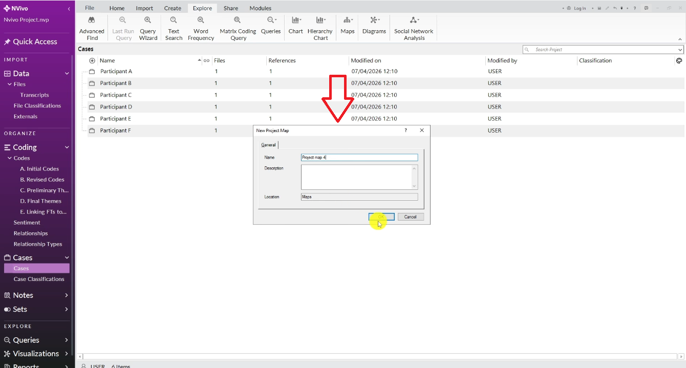
Step 2 — Create a New Project Map
- In the top menu, click Explore
- Click Maps, then select Project Map
- Give your map a descriptive name (e.g., ‘Project Map — Theme 1 Participants’)
- Click OK
Your blank project map canvas will open. You’re now ready to add items.
Step 3 — Add Participants and Themes to Your Map
On the right-hand panel, click the arrow to open Project Items.
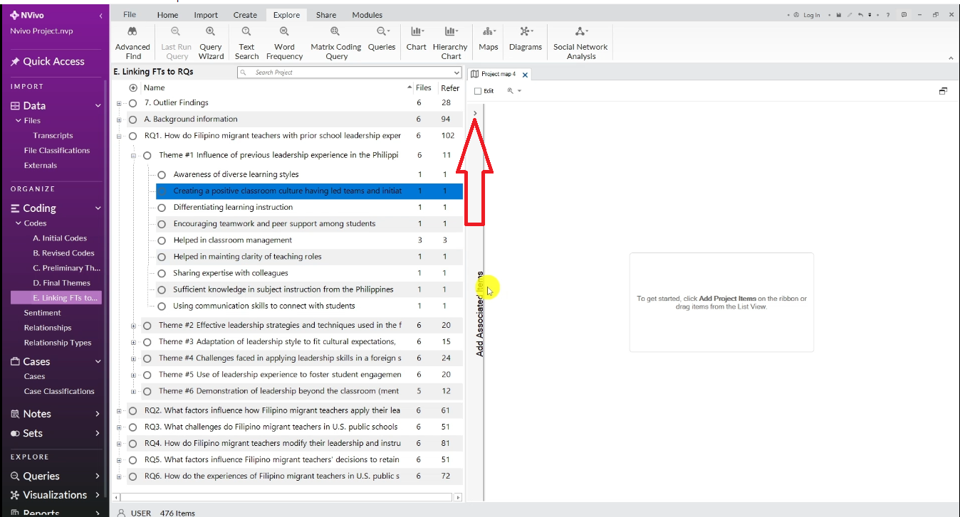
From here you can drag and drop your cases and codes directly onto the canvas.
For example, if you want to see how two participants contributed to a specific theme:
- Go to Cases, select the participants you want to compare, and drag them onto the canvas
- Go to your Codes, find the codes under the relevant theme, and drag those onto the canvas too
NVivo will automatically draw connection lines between participants and the codes they contributed to.
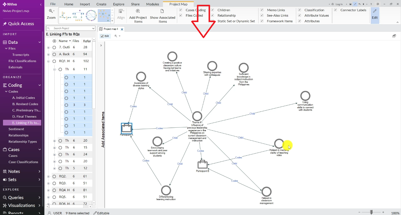
Step 4 — Organize and Format Your Project Map
Once your items are on the canvas, use the Project Map menu in the top bar to choose a layout:
- Circular — useful for showing equal relationships between all items
- Hierarchy — useful for showing a top-down structure (themes → codes → participants)
- Directed — best for showing flow and contribution (who said what about which theme)
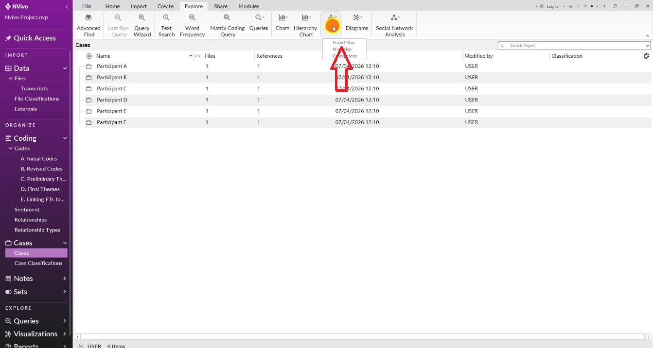
After selecting a layout, you can click and drag individual items to reposition them for clarity. To reduce clutter, go to Connector Labels and deselect it — this removes the repetitive labels that can make maps hard to read.
Step 5 — Export Your Project Map as an Image
- Right-click anywhere on the project map canvas
- Select Export Map
- Save it as a JPEG or PNG
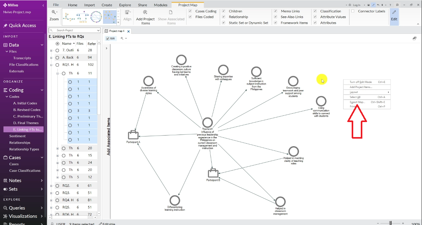
You can now insert this image directly into your findings chapter or dissertation. It serves as a visual evidence piece showing how your data supports your themes.
3 Project Map Examples for Thematic Analysis
Here are three different ways to use NVivo project maps, based on what you want to show.
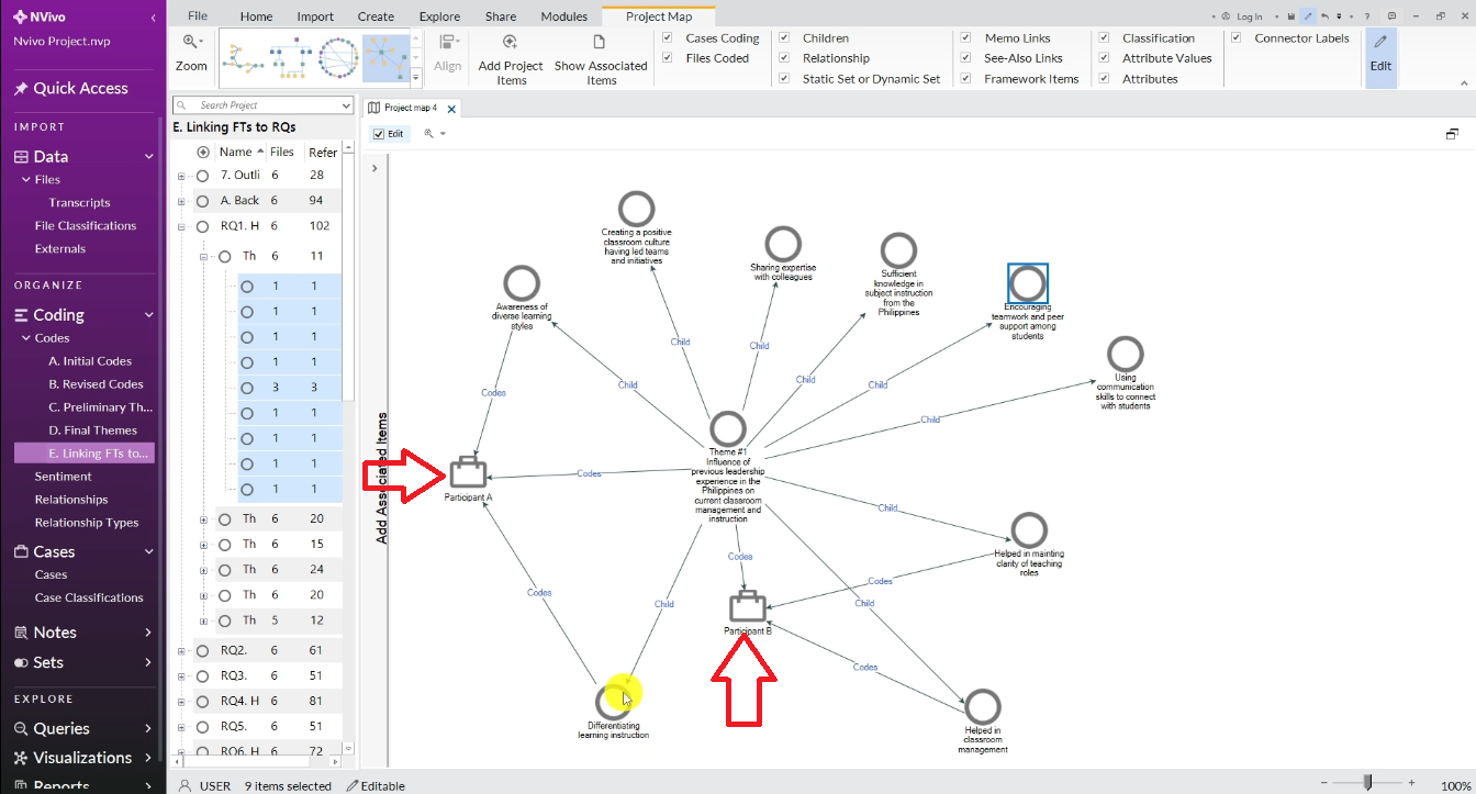
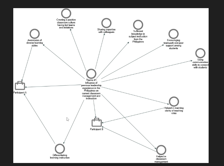
Example 1 — How Two Participants Contributed to One Theme
Add two participant cases and all codes from one theme. This reveals which specific issues each participant highlighted and which codes only one participant mentioned. For instance, you might discover that Participant A focused on awareness of learning styles while Participant B focused on classroom management — two distinct contributions to the same broader theme.
Example 2 — How All Participants Connect to All Themes
Add all participant cases and all themes to a single map. This is more complex but powerful — it shows the full picture of who contributed to what. You might find that most participants contributed to Theme 1 and Theme 3, but only a few contributed to Theme 6, which tells you something meaningful about the prominence of different themes in your data.
Example 3 — Which Participants Contributed to a Specific Theme
Choose one theme, add all participant cases, and drag in all the codes under that theme. This reveals at a glance which participants were relevant to that theme and which were not. If Participant D doesn’t connect to any code in Theme 6, that’s analytically significant — it means their experience didn’t speak to that particular finding.
Final Thoughts
NVivo project maps are one of the most underused features in qualitative research, and one of the most impressive things you can show your supervisor. They turn your coded data into a visual argument — showing not just what your themes are, but how they emerged and who contributed to them.
Once you’ve built your project map, the next step is writing up your findings. Check out the guide on how to report findings after conducting thematic analysis in NVivo for a step-by-step walkthrough of turning your maps into written analysis.
If you’d rather have this done for you, I offer a done-for-you qualitative data analysis service that includes coding, theme development, and visualization — with a five-star rating from PhD students across the world.